M Ying Hei
M Ying Hei, the new Chinese equivalent to Latin sans serif classics like Helvetica, Frutiger
or Univers
Ever-growing international markets make consistent communication across countries and font systems increasingly important. With M Ying Hei™, Monotype has introduced a new Chinese sans serif that blends perfectly with Helvetica as well as other popular Latin sans like Avenir Next, Neue Frutiger or Univers Next.
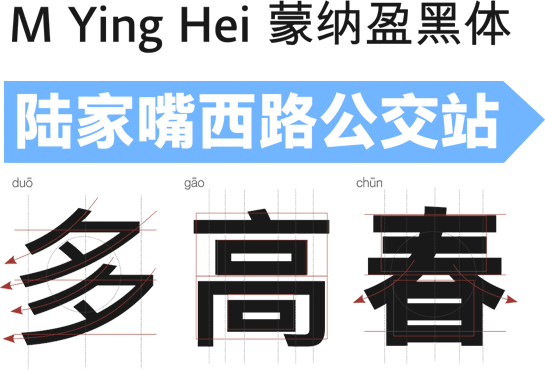
The Monotype design team in Hong Kong, led by Kenneth Kwok and Robin Hui, developed the new typeface M Ying Hei with an eye to elegance and performance for use on monitors and in print. Sufficient spacing between the characters as well as open and unique forms guarantee optimal legibility, even under difficult conditions.
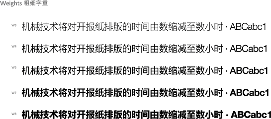
A relatively minimalist design that dispenses with any decorative elements helps the reader quickly absorb the contents of a message.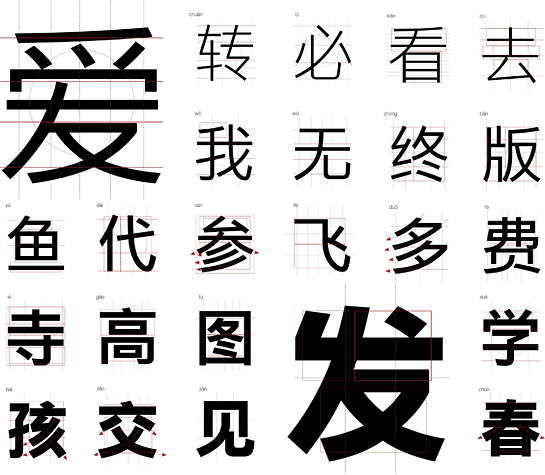 M Ying Hei is available in five weights with versions in simplified and traditional Chinese for use in text and headlines. For Latin characters, an adapted version of Neue Helvetica is included that complements M Ying Hei graphically.
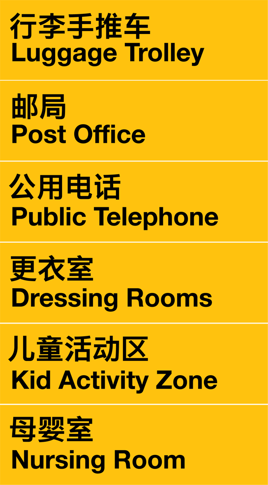
 The well-equipped and thought-out M Ying Hei also has many strengths in combination with Latin sans serif fonts. M Ying Hei is not only the ideal partner for international company presences; the Chinese font can also be used perfectly in combination with Latin fonts in signalization systems.

A relatively minimalist design that dispenses with any decorative elements helps the reader quickly absorb the contents of a message.
 M Ying Hei is available in five weights with versions in simplified and traditional Chinese for use in text and headlines. For Latin characters, an adapted version of Neue Helvetica is included that complements M Ying Hei graphically.
 The well-equipped and thought-out M Ying Hei also has many strengths in combination with Latin sans serif fonts. M Ying Hei is not only the ideal partner for international company presences; the Chinese font can also be used perfectly in combination with Latin fonts in signalization systems.
