About Madera
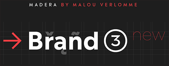
Madera by Malou Verlomme is a typeface made strictly for graphic designers, created as an indispensable type toolbox that can meet the needs of both print and digital environments. Verlomme has drawn on his extensive experience creating bespoke type for major brands, and Madera is a “kind of synthesis” of this work.
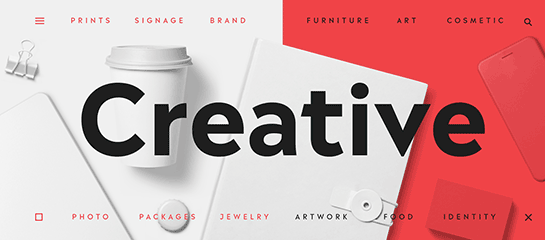
Although designed as a restrained sans serif, the typeface has some punchy personality – with sharpened apexes that inject flavour into the design, particularly in the darker weights and when set at all caps. Madera sits alongside fellow geometric designs such as
Avenir,
Proxima Nova or Gotham, offering a straight-talking tone of voice but with some extra bite.
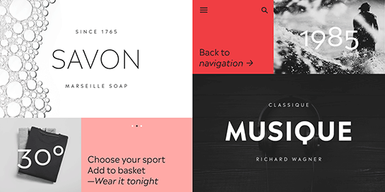
If you’re a large corporation, with a typeface being used in many different environments, you want something that’s just the right balance of visibility and legibility to sustain an extensive amount of communication. “The design is very solid but it doesn’t go out of its way to attract attention,“ explains Verlomme. “It still has a fair amount of warmth and personality, in a very understated manner.“
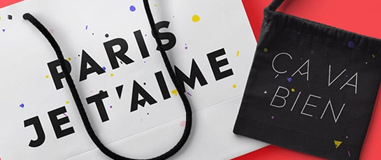
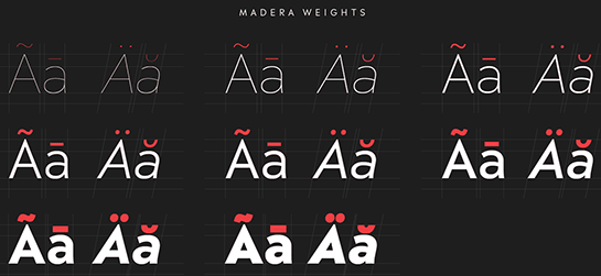
The Madera typeface family has 16 fonts: eight weights of both upright and italics. It is available in OpenType CFF and TTF fonts formats. Each typeface contains more than 650 glyphs with extensive Western, Central and Eastern European language support. It also supports OpenType typographic features like alternatives, ligatures and fractions.

 Although designed as a restrained sans serif, the typeface has some punchy personality – with sharpened apexes that inject flavour into the design, particularly in the darker weights and when set at all caps. Madera sits alongside fellow geometric designs such as Avenir, Proxima Nova or Gotham, offering a straight-talking tone of voice but with some extra bite.
 If you’re a large corporation, with a typeface being used in many different environments, you want something that’s just the right balance of visibility and legibility to sustain an extensive amount of communication. “The design is very solid but it doesn’t go out of its way to attract attention,“ explains Verlomme. “It still has a fair amount of warmth and personality, in a very understated manner.“
 The Madera typeface family has 16 fonts: eight weights of both upright and italics. It is available in OpenType CFF and TTF fonts formats. Each typeface contains more than 650 glyphs with extensive Western, Central and Eastern European language support. It also supports OpenType typographic features like alternatives, ligatures and fractions.
