Discover legacy content from linotype.com, preserved for your reference.
Malabar
A new family with sturdy serifs – Malabar
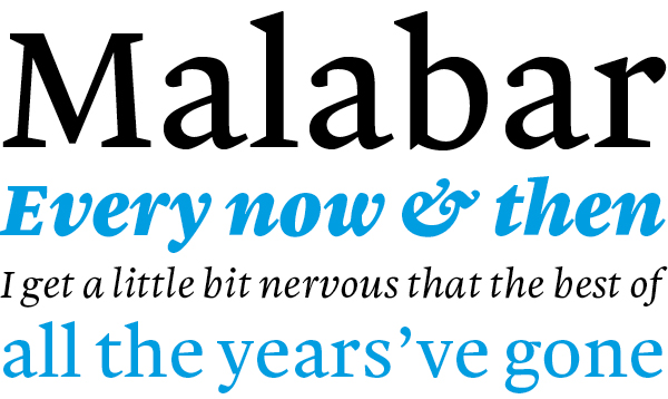
A new type family for extensive text, Malabar™ likely is the first typeface in the Linotype library named after a brew of coffee. Originally, the typeface had a different name. While Dan Reynolds was designing the first weights of the typeface on the MA Typeface Design course at the University of Reading in the UK, it was known as Martel, after the eighth-century Frankish hero Charles Martel. After returning to Berlin, he spent a few additional months finishing up the typeface for release. The nearest coffee shop to his apartment was Barcomi’s, in Kreuzberg’s Bergmann Straße. Quaffing copious amounts of India Monsooned Malabar was exactly what he needed to complete this study oldstyle serif family.
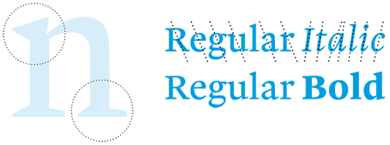 |
A strong diagonal axis is apparent within the curves of Malabar’s letterforms. Sturdy serifs help strengthen the line of text in small point sizes, as well as define the overall feeling of the face. Malabar’s x-height is very high, a deliberate choice that make the most important parts of lowercase letters visibly larger in tiny text. The height of the capital letters is also rather diminutive, allowing for better character fit as well as eliminating a bit of clumsiness in German typesetting.
As an oldstyle design, Malabar’s Roman, or Regular weight, was informed both by contemporary ideas of typeface design (sheared terminals, the wider-drawn s) as well as by 16th-century masters. True to form, the design of the Italic references old types, as well as current needs. The slopes in the Italics begin at 9°. The Roman’s wedge serifs become more slab-ish in nature as the letters’ weight increases. Malabar Heavy is best relegated to headline use. Malabar Bold and Bold Italic may be used for text emphasis, a job for which the Heavy and Heavy Italic are too dark.
As an oldstyle design, Malabar’s Roman, or Regular weight, was informed both by contemporary ideas of typeface design (sheared terminals, the wider-drawn s) as well as by 16th-century masters. True to form, the design of the Italic references old types, as well as current needs. The slopes in the Italics begin at 9°. The Roman’s wedge serifs become more slab-ish in nature as the letters’ weight increases. Malabar Heavy is best relegated to headline use. Malabar Bold and Bold Italic may be used for text emphasis, a job for which the Heavy and Heavy Italic are too dark.
 |
Malabar’s lowercase letters have two sorts of serifs: those on the x-height, as well as on the ascenders, and those on the baseline and the descenders. The upper serifs are triangular and flag-like. The lower serifs are wedge serifs, and are asymmetrical. The left side of the lower serif has a steeper angle than the right. The general impression of these serifs, especially when viewed in larger point sizes, is that they are simple – perhaps even primitive. However, the directness of the serif treatment is rooted in the purpose of the typeface: small-sized newspaper printing. In tiny text sizes, serifs become so small that fine modeling treatments appear no different from wedges like those used in Malabar; depending on the printing quality employed, fine serifs may break apart all together. Malabar’s serifs were developed to avoid this problem. As for modeled serifs that may be appreciated in larger sizes only, Malabar is not timid; its sharp, direct serifs are a clear feature of its DNA.
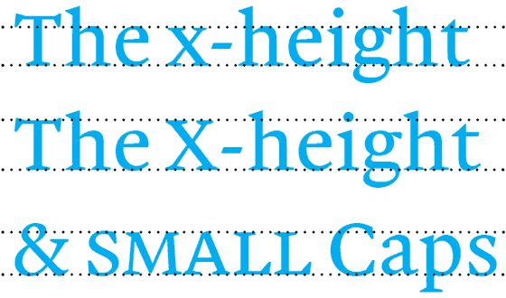 |
Small caps and uppercase letters are generally related; small caps may have somewhat wider proportions than the uppercase, and their height is certainly shorter, but they otherwise do not often deviate significantly in their forms from uppercase letters.
While Malabar’s small caps and uppercase letters tend to use the same basic forms, there are a few exceptions, notably P and R. Although small caps are by definition ‘smaller’ uppercase letters, in text setting they appear together more often with the lowercase, and it may be desirable to lowercase-ify them in order for these to work together better. In essence, ideal small caps create a third case that takes elements from each of the other two.
While Malabar’s small caps and uppercase letters tend to use the same basic forms, there are a few exceptions, notably P and R. Although small caps are by definition ‘smaller’ uppercase letters, in text setting they appear together more often with the lowercase, and it may be desirable to lowercase-ify them in order for these to work together better. In essence, ideal small caps create a third case that takes elements from each of the other two.
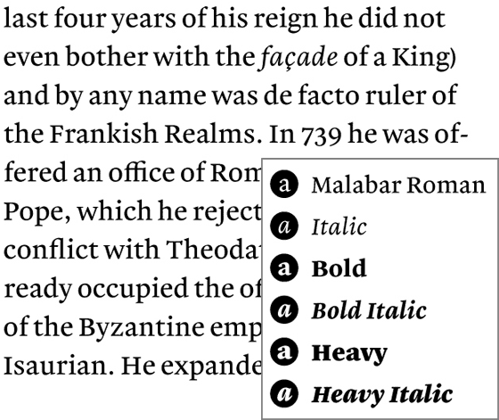 |
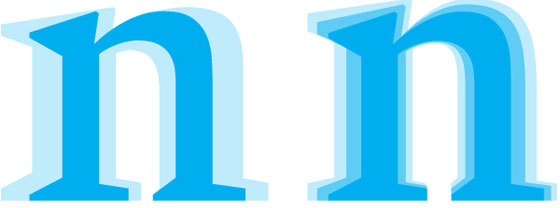
Aside from Malabar’s Bold and Heavy letters being darker and wider than the Regular, their x-height was taller and the overshoots were larger. The stroke contrast also increases as the family picks up weight. Between Regular and Heavy, the letters’ thin strokes change less than the thicks.
 |
Compared with the Heavy, Malabar Bold is about 61 percent bolder than the Regular. Malabar Bold, Bold Italic, Heavy, and Heavy Italic do not have small caps or oldstyle figures, just lining figures. But they do share the same ligatures as Malabar Regular, and have full sets of superior and inferior numerals.
 |
The design of Malabar’s Italic references old types, as well as current needs. Its slopes begin at 9° (Malabar Heavy Italic has a 12° angle). The uppercase letters, as well as the figures of the Italic family members, are more or less sloped romans. But the lowercase letters are much more cursive. Instead of serifs, their letters make use of clear in and out strokes. These feel like Malabar serifs anyway, since they are also long and sharp in their form.
Malabar received a Certificate of Excellence in Type Design at the Type Directors Club of New York TDC2 competition in 2009 and the 2010 German Design Prize.
Malabar received a Certificate of Excellence in Type Design at the Type Directors Club of New York TDC2 competition in 2009 and the 2010 German Design Prize.