Discover legacy content from linotype.com, preserved for your reference.
Mantika Informal
An informal script with formal intentions – introducing Mantika Informal

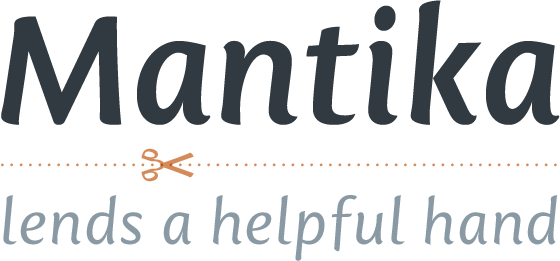
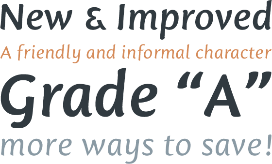
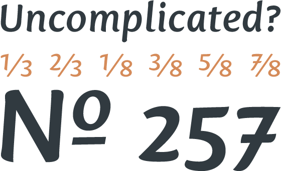
Jürgen Weltin’s Mantika™ Informal is pretty difficult to categorize, but very easy to like. This particularly reader-friendly typeface in regular and bold weights, brings to the table the informal fluidity of a script, the consistency of an inclined italic, and the open and airy forms and contrast of a humanist sans. The result is a warm, approachable, and very legible typeface that is never static and staid, but rather invites an attentive, reading eye.
 |
The original idea behind Mantika Informal lay in the challenge to create a typeface for setting children’s books. German designer Jürgen Weltin aimed to create a reading typeface for those just starting to learn how to read. On the one hand, it should help create clear word-images; on the other, its letterforms should remain uncomplicated but resist mechanical and industrial sterility. Mantika’s subtle cursive lines stress the printed word’s connection with handwriting, in addition to making the transition from school writing exercises to printed texts seamless and effortless.
 |
The resulting slightly organic and cursive forms that developed during the design process are so captivating that Mantika Informal may be used for a multitude of unintended applications – anywhere a friendly and informal yet sophisticated character could lend a helping hand, Mantika is there, giving a fresh accent to anything from packaging design to food products. With a broad character set encompassing support for Cyrillic and Green, Mantika Informal’s two fonts make for a versatile and dynamic typeface that surely will find its place in a broad range of applications.