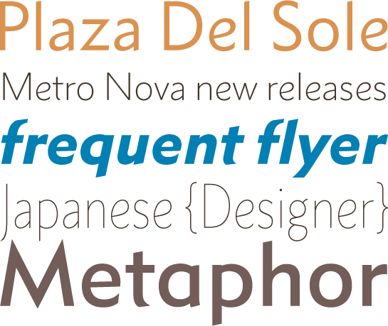
Metro Nova
Metro Nova. A rediscovered classic with a new look
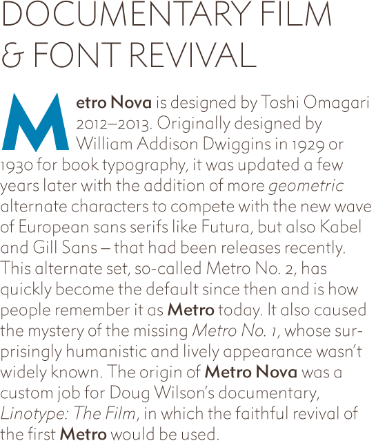
With Metro® Nova type designer Toshi Omagari is presenting a revival of the classic font, Metro, designed in the 1920’s and 30’s by William Addison Dwiggins. The rediscovery of the original design thus shows a facet of the popular font, which has been largely unknown until now.
William Addison Dwiggins was born in 1880 and in the 1920’s he was working as a well-known and successful advertising and book designer. Even from the standpoint of book typesetting the popular, structured sans serif of that time was not very satisfactory. So it was only logical that the Mergenthaler Linotype Company should give Dwiggins the task of designing a sans serif. Dwiggins got down to work and his first font, the Metroblack appeared at the end of the 1920’s. Admittedly, for marketing purposes the friendly, humanist forms for the first Metro font are too far removed from competitor products such as Futura® or Gill Sans®. A short while later a revised version appeared under the affix #2, in which curves were withdrawn and slanted crown fonts were replaced by pointed fonts. It was these forms that determined the design of the very successful Metro #2 in subsequent decades.

It was not until recently that the original letters of Dwiggins’ Metro were discovered, more or less by chance. The cinema director, Doug Wilson is keen to use a font from the early days of Linotype for the title of his film on the 125th anniversary of the Linotype typesetting machine and he has decided on the original Metro font. When Wilson asked him to digitize the typeface, Toshi Omagari was immediately enthusiastic. For, in contrast to the stiff forms of the familiar Metro #2, which did not particularly attract him, Omagari was looking at a friendlier version of the font, until then unknown to him. This not only decided for Omagari the question of the whereabouts of the Metro #1, but led him to decide to dig up a typographic treasure and to design a font family with a contemporary structure. Metro® Nova was born.
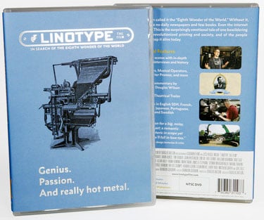
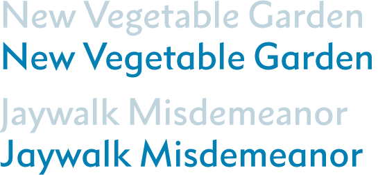
The letters of the Metro Nova show the variations in the stroke width typical for a humanist sans serif. Moreover, the open “a” and the looptail “g” recall the forms of an serif font. Slightly slanted line ends and crowns give an additional, dynamic touch, the conical arches in the common “f”, “j” and "t” are among the characteristic features of Metro Nova. The diagonal, slightly offset line ends in the “c” and the rounded form of the common “e” lend the font additional dynamics. Both letters almost remind you of a cursive font.
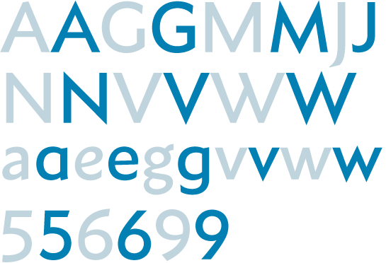
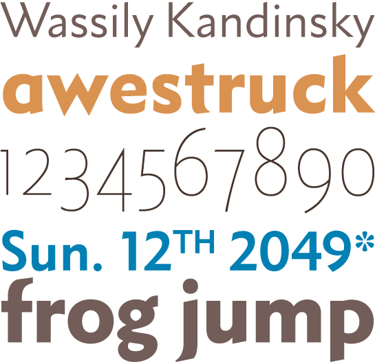 Even when Omagari had found his favourites in the forms of the original Metro, he did not sweep the Metro #2 letters under the carpet. They are available as alternative letters via the format sets in Open Type font. There are striking differences in the altered letter forms of a, e and g, which are designed opentail with horizontal crossbars in the alternative characters, in the closed form. Letters such as v, w, M, N, V and W show the pointed crown recognised from Futura and also the stems of the uppercase M are drawn slightly diagonally. Not least the uppercase “G” is given a crossbar and the “J" also loses the characteristic slanted rounding in the descender. In addition, some of the figures such as 5, 6 and 9 are more open and are designed with less rounding.
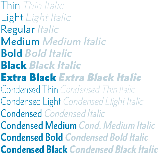
 Omagari has clearly expanded the Metro Nova environment in comparison with the original Metro. The new font is available in Thin to Extra Black in seven stroke widths, each with matching Italic. Omagari has also designed all the font styles in a narrower tracking condensed variant.
 Small caps and various figure sets with uppercase and mediaeval figures, intended for the table and proportional set complete the range of characters. Designers from the German-speaking regions ought also to be delighted to see that the majuscule ß has been included.

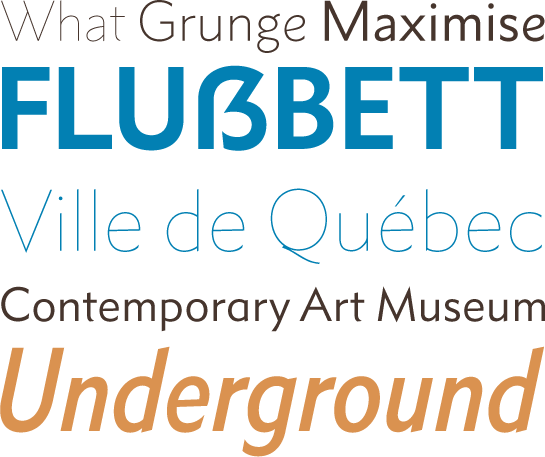 Even though Metro Nova has William Addison Dwiggins’ original Metro as its proto-type, it is still in many respects a new font. Until now, the image of Metro was determined by the forms of Metro #2, so that Metro Nova with its rediscovered, friendlier, more rounded forms has practically been given a new face. As a designer you can reduce the humanist character of Metro Nova letter by letter and access the alternative characters of Metro #2. Thus, Metro Nova actually contains two fonts. And not least, thanks to its fantastic, fashionable large structure, Metro Nova is well equipped for a variety of applications. Metro Nova not only cuts a good figure in advertising and headlines, but thanks to its relatively high x-height it also makes a good impression in small font sizes. As a classic font with a modern aura Metro Nova is thus a strong typographic all-rounder, with the capacity to master the most diverse tasks to perfection.
