Neue Frutiger 1450
Neue Frutiger 1450: one of the first fonts to conform to the new German standard on legibility of texts
The new German standard DIN 1450, which will come into force in mid-2013, will not only regulate how text is displayed on public signage systems, but will also set out clear guidelines for the appearance of other forms of text. The aim is to ensure that texts are legible for everyone. Standard DIN 1450 provides numerous recommendations for the design of typefaces. Hence, letters are to be constructed so that they retain their essential outline, even where conditions for recognition are poor. To be avoided as much as possible are problems with characters that can be easily confused, such as uppercase ‘I’ and lowercase ‘l’ or uppercase ‘O’ and figure ‘0’ and with letter pairs that can readily seem to merge together. Standard DIN 1450 also outlines explicit requirements with regard to character proportions, line thickness and letter spacing. For the three basic forms of text, namely reading text (e.g. continuous text), consultation text (e.g. marginalia and image captions) and signalisation text (e.g. signage) and, relative to x-height, the required thickness of hairlines, baselines and the size of letters are stipulated. The standard also provides instructions on how text is to be set, on line spacing and margins. All the details can be found in the article “DIN 1450 – the German standard on legibility of texts” or by purchasing the original DIN 1450 Standard.
A regulation that may seem rather incomprehensible at first will, in fact, prove to be surprisingly easy to comply with in practice with the help of Monotype. To coincide with the introduction of the new standard, typefaces that meet the stipulations of DIN 1450 will be made available. The suffix ‘1450’ will be added to the typeface name to indicate that the corresponding font family not only conforms to the specifications for proportion and line thickness, but that the characters have also been designed in accordance with the requirements of DIN 1450.
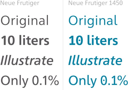
 The first of these new typefaces is Neue Frutiger 1450. This new family, a member of the popular Grotesque sans serif class, is available in four weights that conform to DIN 1450, in each case with a matching italic variant. In addition, Neue Frutiger 1450 includes modified forms of the characters ‘0’ and ‘1’ and lowercase ‘l’ with the corresponding accentuating graphemes and ligatures, although the normal glyphs will continue to be available as alternatives. The forms of the characters of Neue Frutiger 1450 meet all the stipulations of the new standard and you will thus be able to use the family without qualms in all contexts in which you are required to conform to the requirements of DIN 1450.
