Parkinson Electra
Parkinson Electra: impressive serif with individual personality
Electra® was originally designed in the early 1930s by William Addison Dwiggins using the serif fonts of the 15th and 16th centuries as models. This unique serif font has been systematically remodelled by Jim Parkinson to make it more suitable for the demands of modern day printing.
Although Dwiggins used fonts such as Bodoni and Baskerville as his patterns, Electra is significantly more dynamic than its forebears. Dwiggins was able to combine the historical essence with the spirit of the 1920s and 1930s, making Electra into a serif font with a unique character.
And more than 75 years later, while Parkinson utilised original drafts and early Electra sample fonts for his modification, his objective was not to create a simple clone of the typeface. Particularly helpful was the insight he had gained during the early 1990s, when he remodelled Electra for use by a newspaper, the San Francisco Chronicle.
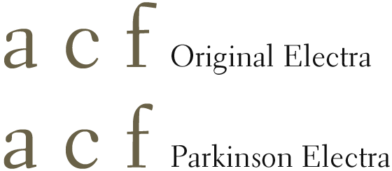
Of the features he has retained, that which is most reminiscent of a newspaper font is the markedly reduced set width of Parkinson Electra® when compared with that of the original Electra. Parkinson Electra is also very slightly more robust than its precursor while its curves have been somewhat softened. This has resulted in a reduced contrast stroke width which, together with the faint hint of a groove in the remodelled serifs, further offsets the rigour of the classic Antiqua form and enhances the dynamic character of the new font. But Parkinson has only occasionally modified the actual forms of the letters, being very restrained when doing so. For example, the drop of the “a” and the “c” is plainly rounder, while the arch of lowercase “f” is slightly shorter.
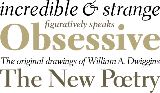
Available in the three font weights Regular, Bold and Heavy, Parkinson Electra is equipped for coping with almost all applications. Used in its Heavy version, it cuts the perfect figure in headlines.
All font weights have real Italic versions in which the letters are a little narrower but much more energetic, with gradually decreasing lines. Letters such as the lowercase “a”, “e” and “k” have a different form in their Italic versions, while the “f” gets a descender. One eye-catching aspect is the unusual design of the “&” symbol.
All font weights have real Italic versions in which the letters are a little narrower but much more energetic, with gradually decreasing lines. Letters such as the lowercase “a”, “e” and “k” have a different form in their Italic versions, while the “f” gets a descender. One eye-catching aspect is the unusual design of the “&” symbol.
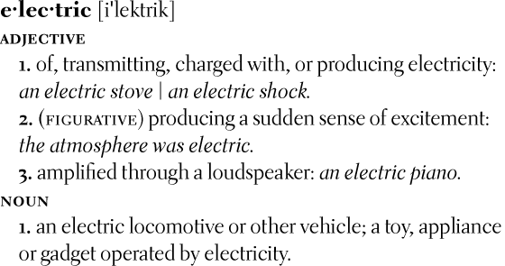
Small caps and various numeral sets are available for all versions. Both lowercase and uppercase numerals can be proportionally adjusted or aligned for tables. In its OpenType Pro variant, the font has an extended set of characters that cover the requirements of most Middle European and many Eastern European languages.
Parkinson Electra has the imposing elegance of a classic serif font without seeming overly rigid. Its stable and readily legible type image and contemporary design make it suitable for commercial texts and high volume printing. Its strongly pronounced characteristics also mean that Parkinson Electra would be the ideal corporate font.


