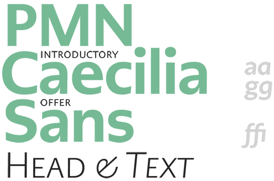
PMN Caecilia Sans
The new PMN Caecilia Sans – a unique, well-equipped humanistic sans
Almost 30 years after the development of the very popular and widely used slab serif font PMN Caecilia®, Peter Matthias Noordzij has expanded his font, adding a sans variant to the extended family. Derived from the familiar foundations of the original font, PMN Caecilia Sans Text and PMN Caecilia Sans Head have been optimized for screen use. However, their restrained character and great options make them ideal for many different applications.

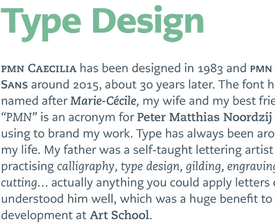
The history of PMN Caecilia goes back to the early 1980s. Peter Matthias Noordzij developed a slab serif (then named Academic) with a strong humanistic influence and gave it a true italic, derived from the Antiqua – a novelty at the time. Adrian Frutiger at Linotype noticed the font’s potential, but it wasn’t until 1991 that the new font appeared as PMN Caecilia (PMN are Noordzij’s initials). The font quickly became an insider’s tip among designers.
There were thoughts of designing a sans-serif version of PMN Caecilia as early as the 1990s; it took 25 years, however, before Noordzij found the time to design it. (He might have been influenced by the use of PMN Caecilia on Amazon’s Kindle.)
Noordzij kept the humanistic framework of the font, but made some slight modernizations and adjustments, including open forms and a large x-height, which guarantee good legibility. Noordzij also kept the familiar weights from the slab serif, so that both fonts harmonize with one another and can be combined easily. The sans also has three additional styles, however: the Thin and Extra Light, as well as the bolder Black.
Since the true Italic, in Noodzij’s view, loses in style in the bolder versions, he provided a second, inclined Oblique option for all weights. All styles are well equipped with various number sets, small caps and ligatures. In addition to PMN Caecilia Sans Text, which is optimized for text, Noordizij also offers PMN Caecilia Sans Head, intended for headlines.
Thanks to the included options, PMN Caecilia Sans can be used for large projects, and also expand the potential of the striking slab serif PMN Caecilia.
