Posterama
Posterama: 63 fonts for a typographic journey through the 20th century
The Posterama super family by Jim Ford is based on an unusual design idea.
A structured sans forms the base. Ford’s slight modifications to the forms and, in particular, striking and characteristic letters adapt that base to various design periods, from 1901 to 2001. Use the 63 display fonts with capital letters and the text fonts with lowercase letters to design posters and signs or in advertising or packaging design.

The starting point for the development process, which stretched over many years, is a font that Ford developed for his band. Inspired by the work of experimental painter and sculptor Marcel Duchamp – also the band’s namesake – Ford created a structured alphabet in the style of Bauhaus typography. He then asked himself what that alphabet would look like under the influence of other eras. With the help of Karl Leuthold and Diane Collier, Ford undertook a journey through the typography of the twentieth century. The result: eight families, each assigned to a year. They are not meant to precisely represent a specific date; rather, they are more symbolic of the time that characterizes the design – influenced by typography, art, or the political climate. In addition to the careful modifications of the basic form, Ford designed distinct letters that express the characteristic features of the given era.
These eight families are designed as uppercase fonts for display typesetting. They each have seven identical weights from Light to Ultra and can be easily interchanged. A ninth and relatively neutral text font also makes the lowercase letters available.
Posterama Text

Apart from slight modifications, the capitals are identical to that of Posterama 1927. Posterama Text is the only family to offer lowercase letters, however. Thanks to its extensively neutral design, it can be used in combination with all the other families. In addition, Posterama Text offers an extended OpenType W1G language support.
Posterama 1901

This family is inspired by the arts & crafts era, as well as the art nouveau movement at the beginning of the 20th century. This era finds its expression, for example, in the narrow letters “C” and “S” or the underlined “O”.
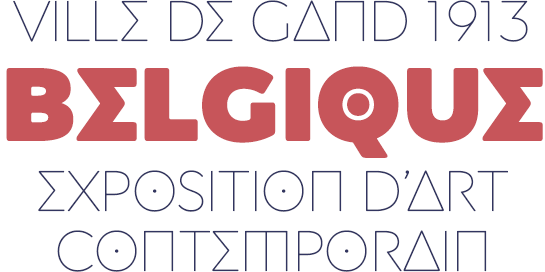
Posterama 1913

The Armory Show of 1913, in which European modern art was shown in America, represents the reference point for the very abstract shapes of this family. Striking are the letters “A” and “N”, designed as a triangle and rectangle, the “E” which recalls a Greek Sigma, and the points in the “O” and “Q”.
Posterama 1919

With this family, Ford refers to the founding of the Bauhaus in Dessau. The most prominent letter of this otherwise carefully modified font is the rounded “A”.
Posterama 1927

The most restrained and neutral design in the Posterama extended family, this font recalls Futura®, which was published by Paul Renner in 1927. An alternate “M” with diagonal legs and a geometric “A” add emphasis to the character of the period.
Posterama 1933

Posterama 1933 picks up on the design of the art deco era. The date itself recalls the great economic crisis in the USA and the coming Second World War. Characteristic is the low x-height, expressed in the low crossbars of the “A”, “E” and “R”, for example.
Posterama 1945

Named after the end date of World War Two, the design of this family recalls the coming Cold War and the tensions between the USSR and the USA. Ford uses forms that resemble Cyrillic letters.
Posterama 1984

The dystopian future novel “1984” by George Orwell lends its name to this family. The geometric, rounded letters “A”, “M” and “N” recall the aesthetics of science fiction films from the 1980s. Additional futuristic letters are also available.
Posterama 2001

A work of science fiction also provides the inspiration for the name of this family: “2001: A Space Odyssey”. The very modern, reduced forms of the Posterama 2001 represent the design originally developed for Ford’s band. Many geometric and reduced forms are included as alternates.