Discover legacy content from linotype.com, preserved for your reference.
Quench
The Juicy and Satisfying Quench
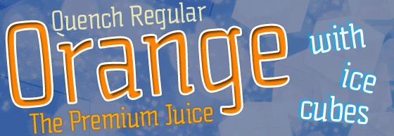
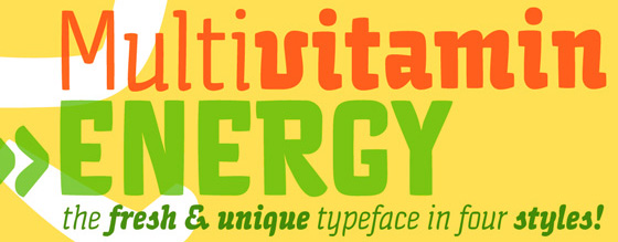
Quench® is a fun and unique typeface from designer Hannes von Döhren. It is unmistakably characterized by its strong contrast of inside and outside forms. The counters are nearly straight and have many right angles. Conversely, the outside curves are smooth and rounded making them soft and almost bubbly.
 |
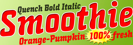
The italics still retain some of the rectangular shapes, but look more like they were made with a brush. Especially in the bold weights the curves are full and juicy.
 |
Used together or individually, the four weights and styles can be used for a wide variety of projects including magazines, advertising, logos, and branding.
 |
To see more samples of Quench, close up views of its details, and the full character set, download Hannes von Döhren’s PDF here (English, 237 kb).