Rameau
Rameau for classic elegance
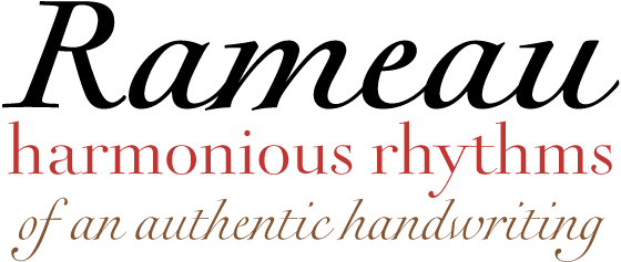
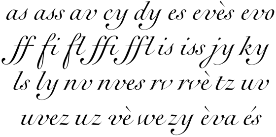
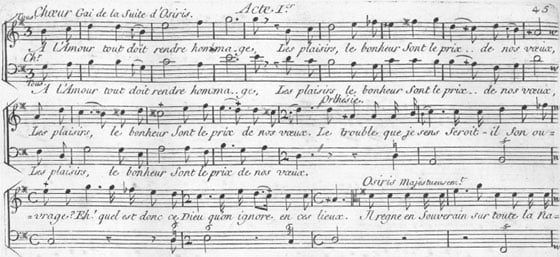
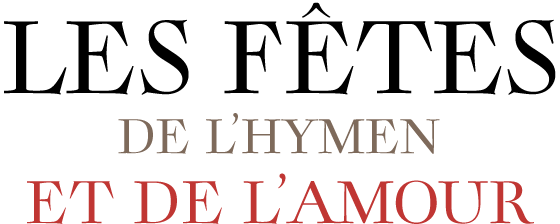
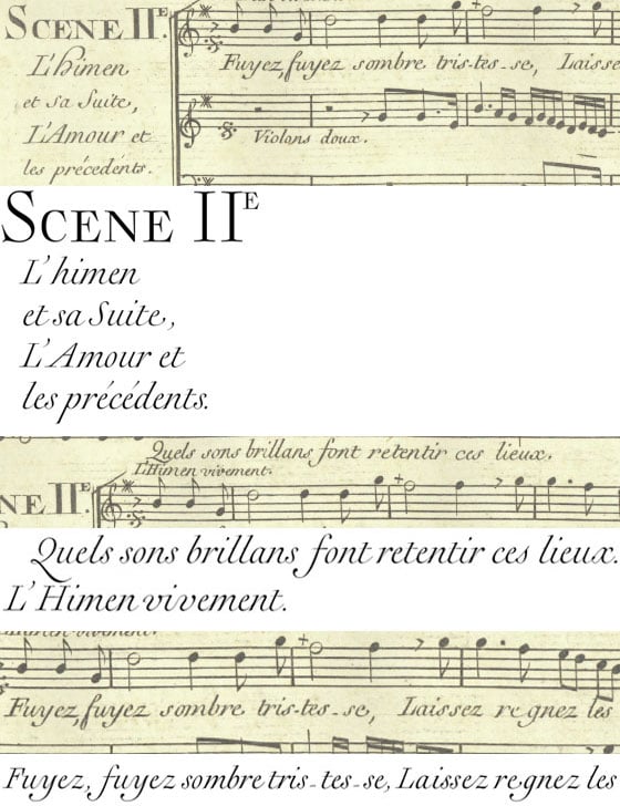
The type family Rameau™ was designed by Sarah Lazarevic. She started with the italics; these she derived from the manuscript of the opera “Les fêtes de l´hymen et de l´amour”, the music for which was composed by Jean-Philippe Rameau in 1747. In the 18th century, musical compositions were published in the form of impressions from copper plates that had been hand-engraved in contrast with books and other texts, which were printed from moveable lead type. The italic letters of Rameau include many ligatures and are thus typical of the engraving style of the period.
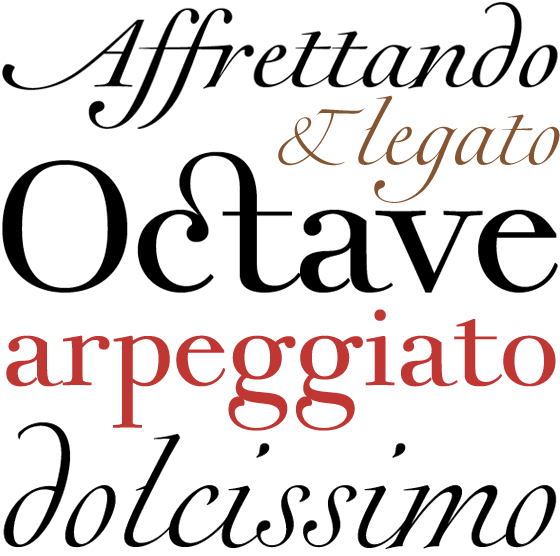
Rameau exhibits much of the harmonious rhythm associated with genuine manuscript. The marked Antiqua contrasts make the pages on which the font is used quite literally sparkle. This effect is enhanced by the excessively sharp terminals and the prominent serifs of the upper case letters.
This highly legible and stylish type family can be used for printing high quality books, invitations, menus and all kinds of texts – anywhere the grace and elegance of France in the 18th century is to be invoked.
On the next page you will find typographically elegant examples of designs using Rameau, produced by the designer of this font, Sarah Lazarevic.
more ... Applications for Rameau


