Discover legacy content from linotype.com, preserved for your reference.
Stevens Titling
Elegance married to versatility – The new Stevens Titling
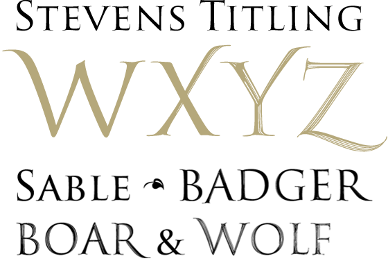
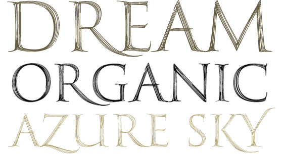
Stevens Titling™, a collaborative work of the both calligraphers John Stevens and Ryuichi Tateno, is a suite of four fonts: Sable Brush, Badger Brush, Boar Brush, and Wolf Brush. The most formal is Sable Brush, its forms precise and with almost no hint of the brush, the handdrawn.
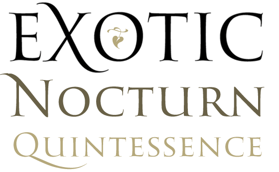 |
| Stevens Titling Sable Brush usage sample |
The Sable Brush variant also comes with a set of small capitals for beautiful, classical titles. An excellent alternative to the much overused Trajan™. Would excel anywhere you’d like to evoke the classical, refined, and elegant.
In the other three styles, the brush strokes are increasingly more evident. These varieties mean that Stevens Titling is all the more versatile, and would be fitting in everything from very formal invitations, through to identity and even posters and advertising.
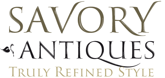 |
| Stevens Titling Badger usage sample
|
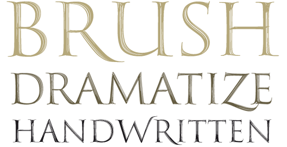 |
| Stevens Titling Boar usage sample |
 |
| Stevens Titling Wolf usage sample |
Also, the individual fonts in the Stevens Titling family are not unfoundedly named after animals. The particular animals – the badger, boar, sable and wolf – are symbolic along with the attributes of their hair for the character of each section’s brush stroke. The Badger font is firm and compact. The Boar is stalwart. The Sable is fine and elegant. And the Wolf is strong and shaggy.