Discover legacy content from Linotype.com, preserved for your reference.
Tanseek
Harmony between east and west: the new Tanseek typeface family

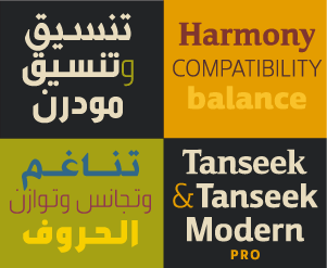
The Tanseek™ typeface family is one of the first harmonious blend of Arabic and Latin, serif and sans serif typefaces, to serve the needs of 21st century graphic communicators. Developed by a team of four typeface designers – Arlette Boutros, Mourad Boutros, Richard Dawson and Dave Farey – it brings the best of Latin and Arabic typeface design into one unified super-family.
Setting Arabic and Latin typefaces has, historically, been a challenge. This is because the Arabic and Latin alphabets have no common design elements and it was hard to reconcile distinctly different designs. While some Arabic and Latin typeface families were available, none provided the typographic system of Arabic and Latin, serif and sans, in addition to modern and traditional design styles.
Big Differences
Although both Arabic and Latin alphabets are rooted in calligraphic writing, the similarity ends there. Most Latin typefaces are designed such that each letter is set and spaced apart from the other characters. Latin typefaces are vertically constructed. Arabic letterforms are constructed more horizontally. Arabic has no capitals, but the same letter can have up to four forms, depending where it falls in a word. Individual Arabic letters are more calligraphic than Latin characters. Letters within a word are physically linked to each other by a continuous horizontal stroke. Ascender and descender lengths within an Arabic font vary more widely than in a Latin font, and up to eight diacritical marks denoting vowel sounds often extend beyond the ascenders and descenders.
A New Approach
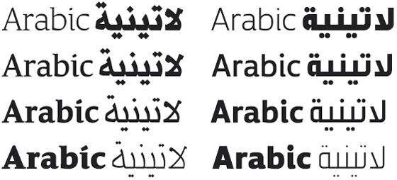
Compatibility and harmony between Arabic and Latin typography could not be achieved by simply combining standard typeface designs. A new technique was needed, and this is what the Tanseek – meaning “harmony” in Arabic – design team set out to achieve. To attain a balanced relationship between the two alphabets required adjustments to both. The overall height and depth of the alphabets needed to be made more similar. Through a series of tests, the design team found that the Latin lowercase could be reduced slightly – bringing the two alphabets into closer accord – with little loss in design clarity. Within the Arabic design of Tanseek, the central portion of the letters – visually equivalent to a Latin lowercase x-height – was raised and increased to correspond with its Latin companion. An additional benefit of these adjustments is the uniform typographic color that results when blocks of copy are set in the two alphabets.
The Arabic and Latin styles of typeface design fall into two main categories – traditional and modern for Arabic and serif and sans serif for Latin. Fortunately, these two sets of alphabets relate stylistically: traditional Arabic with Latin serif and modern Arabic with Latin sans serif.
The Tanseek typeface family is the product of over three years of research, study, experimentation, design – and redesign. It is made up of Arabic and Latin designs in traditional, modern, serif and sans serif styles. Each style is available in four weights, ranging from light to extra bold. And all work in perfect harmony.
 |
Other Multilingual typefaces
What is really special about Tanseek and Tanseek Modern is the family’s harmonizing of so many different styles and traditions. But Linotype also offers other typefaces that are multilingual, especially for users looking to cover both the Latin and the Arabic scripts. For more examples like this, visit our New Arabic Typefaces for Multilingual Communication Today page!
What is really special about Tanseek and Tanseek Modern is the family’s harmonizing of so many different styles and traditions. But Linotype also offers other typefaces that are multilingual, especially for users looking to cover both the Latin and the Arabic scripts. For more examples like this, visit our New Arabic Typefaces for Multilingual Communication Today page!