Vesta
Vesta, an exceptional sans serif family from Gerard Unger.
Vesta™ was originally designed as an orientation and information system for the city of Rome, the birthplace of the roman alphabet. The forms are inspired by letterforms found on a frieze in the Vesta temple in Tivoli.
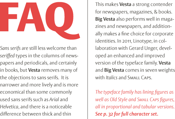
Vesta has more contrast than the average sans serif but, like many of other designs of Gerard Unger, let in a lot of light – the letterforms are open, the counters generous. Relatively narrow and hence economical – without feeling too compressed – Vesta is an ideal solution for newspapers and magazines, and numerous other applications, including corporate identity and more.
Big Vesta was intended as Vesta’s display partner. However, it also performs very well at small sizes – its large x-height and short ascenders and descenders make it particularly economical, making it ideal when space is limited; for example on a mobile display.
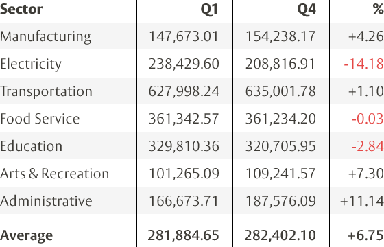
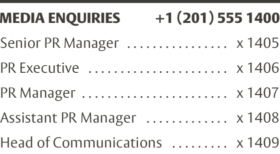
Vesta and Big Vesta are now available in seven weights – from Light to Black – and include everything necessary for setting extended texts well: italics, small caps, and a range of figures, including old style, lining, and tabular figures. All in addition, Vesta is available as a family of OpenType fonts with a very large Pro character set and supports most Central European and many Eastern European languages.
