Vialog 1450
Vialog 1450 – new DIN-compliant styles of the signage font with optimal legibility
Monotype is offering another font that corresponds to DIN 1450 (barrier-free reading): Vialog® 1450, by Werner Schneider and Helmut Ness. This open Grotesque offers optimal legibility even under difficult conditions.

Use Vialog 1450 for information display in guidance and orientation systems, for example, on signs and posters, in advertising, or for corporate design.
Vialog 1450 shares its basic form with the original Vialog®, which is presented in more detail here in the overview article. Legibility and unique letter forms were a priority from the beginning – that is, the best conditions for meeting the requirements of DIN 1450. Since mid-2013, this standard has regulated the design of text and signage systems to ensure that they are as easy to read as possible. DIN 1450 also makes recommendations for letter forms and structure so that they are still clearly legible under difficult conditions. Vialog already had distinct shapes for the typically confused “l” and “I” as well as clearly distinguishable numbers. Schneider and Ness improved the differentiation between “O” and “0” for Vialog 1450, adding a “0” with an additional marking. They also slightly revised the silhouette of the uppercase “R”.

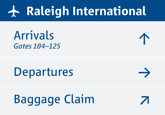 DIN 1450 also makes recommendations for spacing and weights. According to these, the design of the original, space-saving Vialog is a little too narrow. Major changes were required and the letters in Vialog 1450 are designed more generously and have a normal width. In this way the shapes, as Werner Schneider suggests, are very similar to the never-published predecessor of Vialog, a font that he once designed under the name “Euro Type” for the Bonn Ministry of Transport.
Vialog 1450 is available in two weights, Regular and Bold, each with a true italic.
Since the new styles fit perfectly into the Vialog family as normal-width versions, they can also be easily used with the countless available pictograms – in signage systems, for example.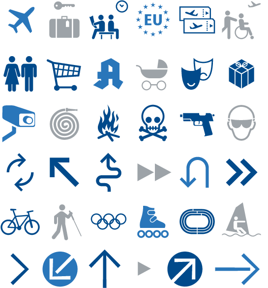 With its open, humanist design, you can also use the new Vialog 1450 anywhere you need a distinct look, not only in the display of information but also for diverse tasks in commercial typesetting or corporate design.
More background information about the original Vialog font family is available in our font feature “The History of Vialog”.

 DIN 1450 also makes recommendations for spacing and weights. According to these, the design of the original, space-saving Vialog is a little too narrow. Major changes were required and the letters in Vialog 1450 are designed more generously and have a normal width. In this way the shapes, as Werner Schneider suggests, are very similar to the never-published predecessor of Vialog, a font that he once designed under the name “Euro Type” for the Bonn Ministry of Transport.
Vialog 1450 is available in two weights, Regular and Bold, each with a true italic.
 Since the new styles fit perfectly into the Vialog family as normal-width versions, they can also be easily used with the countless available pictograms – in signage systems, for example.
 With its open, humanist design, you can also use the new Vialog 1450 anywhere you need a distinct look, not only in the display of information but also for diverse tasks in commercial typesetting or corporate design.
More background information about the original Vialog font family is available in our font feature “The History of Vialog”.
You can also read our interviews with Werner Schneider and Helmut Ness to find out more background information on the Vialog 1450.