Discover legacy content from linotype.com, preserved for your reference.
Virtuosa Classic
Introducing a new mid-century style script – Virtuosa Classic

Hermann Zapf has created dozens of typefaces over the course of his decades-long career. One of the very first was Virtuosa®. Virtuosa is an English copperplate script with character. The design of the typeface was born out of wartime calligraphy that Hermann Zapf kept in a sketchbook.
 |
Now in 2009, Linotype’s Type Director Akira Kobayashi has worked together with Hermann Zapf to release a 21st century digital revival and update of this classic design. Linotype’s Virtuosa typeface is a single font that includes two form variants for each capital letter. There are a number of lowercase alternates and ligatures, too. Virtuosa is the latest of a number of successful Akira Kobayashi and Hermann Zapf collaborations, which include Zapfino® Extra, Optima® nova, Palatino® nova, and Palatino Sans.
 |
Virtuosa was his very first of Hermann Zapf’s script typeface. Based on the same sketches that would inspire Zapfino 50 years later, Hermann Zapf developed Virtuosa in 1948–49. It was originally released as a metal typeface by the Frankfurt-based type foundry D. Stempel AG in 1952. The letters have a slightly different angle in the new Virtuosa than their metal type counterparts did, but such things are easier to achieve with digital technology. The typeface’s designers, Hermann Zapf and Akira Kobayashi, think that the results look better that way, too.
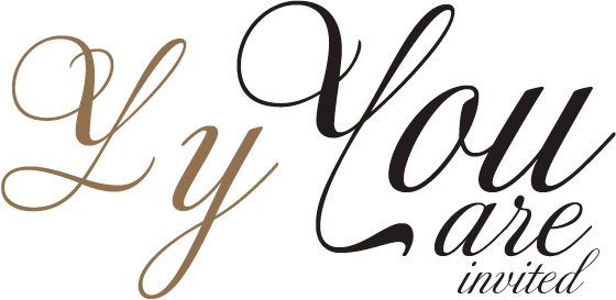
Like all elegant script faces, Virtuosa is intended primarily for use with small amounts of texts, and in display applications. Virtuosa proved itself in the old days as an extremely successful formal invitation face, as well as a selection for certificates and calling cards.
Like all elegant script faces, Virtuosa is intended primarily for use with small amounts of texts, and in display applications. Virtuosa proved itself in the old days as an extremely successful formal invitation face, as well as a selection for certificates and calling cards.
 |
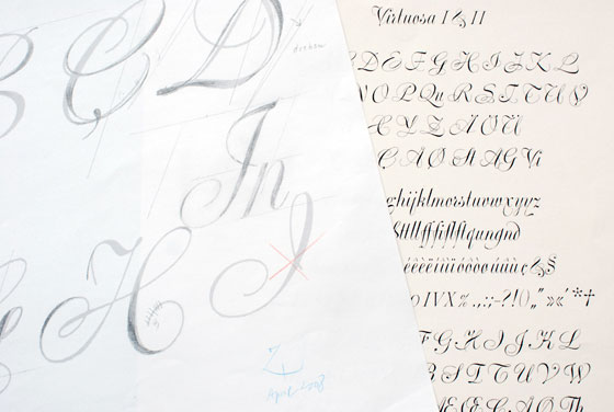
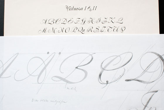
| On the left, Hermann Zapf has sketched more changes to the new Virtuosa typeface. On the right, you can see a test print from the original metal type version of Virtuosa. |
