Discover legacy content from linotype.com, preserved for your reference.
WilliamLucas
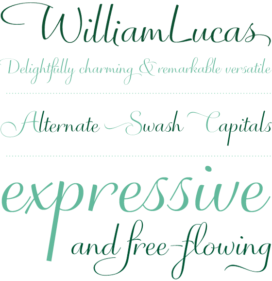
WilliamLucas, a sumptuous and versatile script

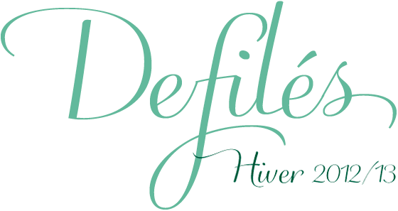
Via OpenType, WilliamLucas™’s numerous alternates, initial, and terminal glyphs, swashes, swash capitals (in some instances four to choose from!), come to life on the page, and make this versatile typeface one that you’ll most definitely enjoy experimenting with. The classic proportions of the lowercase letters combine very well with modest-height caps, that playfully interlock with ascenders and descenders.
 |
“This aspect of the design stems from my experience with lettering for greeting cards. The copy could not be very large but had to be quickly and easily read by people of all ages. Graceful proportions are key to to this.” says its designer, Martin Wait.
 |
And what about the name? Well, that’s simple – it’s named after Waits’ grandson.
 |
more ...