Wolpe Collection
The Wolpe Collection: Five unconventional fonts reissued for the world of contemporary design
Although many decades old, partly forgotten and never digitized, these five fonts from Berthold Wolpe radiate a modern, retro charm. Toshi Omagari of Monotype found these fonts in the archives, and decided to modernize, rework, expand and publish them as the Wolpe Collection. The very different styles of Albertus® Nova, Wolpe Fanfare™, Wolpe Pegasus™, Wolpe Tempest™ and Sachsenwald™ cover a wide range of possible applications.
Berthold Wolpe was born in 1905 in Offenbach (Germany) and studied at the Kunstgewerbeschule Offenbach with Rudolf Koch. He also learned the art of metal engraving there, which later had a significant influence on his font design. As the son of a Jewish family, Wolpe was forced into exile in London in 1935 by the Nazis. He remained there until his death in 1989. In London, Wolpe not only worked as a teacher, but also did design work, first for Fanfare Press and later Faber & Faber. He created over 1500 book covers. It was in this period – the late 1930s and early 1940s – that he designed the five fonts now in the Wolpe Collection.
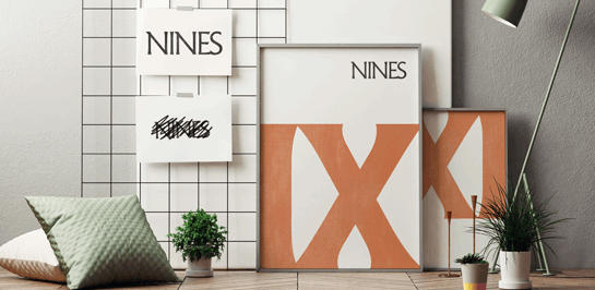 Albertus, named after the German bishop and scholar Albertus Magnus, is the most famous font in the Wolpe Collection and the only one of its kind to date. In the early 1930s, Stanley Morison saw photographs of bronze engravings that Wolpe had made and brought to London. Morison recognized the quality of the design and encouraged Wolpe to expand the letters into a complete font.
Serifs that recall a calligraphic font and a line contrast reminiscent of black letter lend this legible font a historical, somewhat archaic character. Albertus has seen plenty of use – on the mentioned book designs by Wolpe, the street signs in London, the title of a 1960s television show, and in contemporary computer games like “The Lord of the Rings”.
It was this font – more precisely, the unfortunate lower-case “g” – that drove Toshi Omagari into the archives for research. A version of Albertus that had been heavily compressed and reduced for the printing process at the time served as the template for the later digitization. Fortunately, Omagari also found a more beautiful, less compressed headline version, which he used as the basis for the remake, Albertus Nova.
Derived from Wolpe’s sketches, this new version has numerous alternative versal forms, such as the round “E” (which was used in the title of the cult show “The Prisoner”). Omagari also designed Greek and Cyrillic characters as well as three other weights. This means that the timelessly beautiful font, freed its old quirks and well-equipped with five cuts, is now available with a modern – but also somewhat archaic – flair.
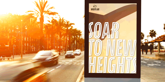 The slightly sloping letters of this upper-case font came about as a book title for Fanfare Press in the late 1930s. Gently slanted shoulders and line ends reinforce the dynamic character of the font, and make the letters seem to stand out from the baseline. For Omagari, Fanfare was one of the most impressive archaeological finds in the archives – even if, at first glance, you would never guess it came from the same designer as Albertus. For the remake, Wolpe Fanfare, Omagari took the bold style as a template and developed four lighter versions, as well as an overlay style with inline figures for the black version. He also added Greek and Cyrillic characters. Ideal for book or movie titles as well as logos and branding tasks, the narrow font can show off its distinctive character in numerous applications.
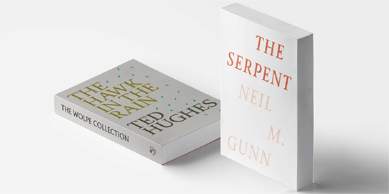 Pegasus, decorated with powerful, triangular serifs, was originally drawn by Wolpe as a supplementary text for the Albertus. A distinct contrast in the line thickness, prominent drops, and round points remove some austerity from the striking design. Numerous irregularities, a lack of symmetry, and some oversized serifs lend Pegasus a very special character with a high recognition value.
In his remake, Wolpe Pegasus, Omagari was ready to correct these corners and edges, but then realized that they were not mistakes, but the conscious design decisions of a man who developed his fonts by hand - always with a view to the optimal readability. Wolpe Pegasus thus retains its unusual character, with Omagari’s addition of modern characters and an italic bold style. All in all, this is a very unique font with a lot of character and personality.
 Cleverly placed, round line ends give the inclined, uppercase Tempest a very friendly and dynamic appearance. Wolpe also created this font for a book title for Fanfare Press. It was a conscious break with the then popular, formal and static italic sans serif.
Omagari was inspired by the modern freshness of the design: it is a font that could have been created recently. For the remake Wolpe Tempest, he maintained the original forms, and added characters with extended line ends – these are ideal for giving a unique touch to logos or titles designs. He also derived three lighter weights from the original, further extending the potential use of this friendly font.
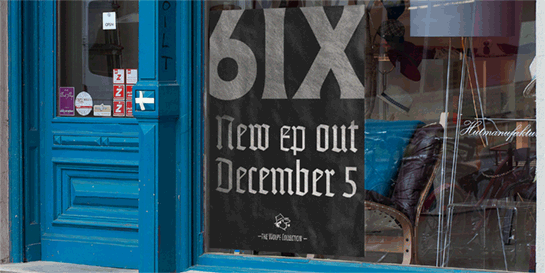 Wolpe designed the Sachsenwald black letter based on inscriptions he had created for a church bell in Germany. Since the character of the letters is softer and less dense than usual, the font seems more friendly and open than other representatives of the genre. The publication in 1938 prevented the widespread use of the font. Apart from the political context, however, black letter fonts work extremely well for music or food packaging, thanks to their special character. This is precisely Omagari’s intended use for the revised and expanded Sachsenwald, which adds a historical, traditional flair to your designs.
Albertus Nova
 Albertus, named after the German bishop and scholar Albertus Magnus, is the most famous font in the Wolpe Collection and the only one of its kind to date. In the early 1930s, Stanley Morison saw photographs of bronze engravings that Wolpe had made and brought to London. Morison recognized the quality of the design and encouraged Wolpe to expand the letters into a complete font.
Serifs that recall a calligraphic font and a line contrast reminiscent of black letter lend this legible font a historical, somewhat archaic character. Albertus has seen plenty of use – on the mentioned book designs by Wolpe, the street signs in London, the title of a 1960s television show, and in contemporary computer games like “The Lord of the Rings”.
It was this font – more precisely, the unfortunate lower-case “g” – that drove Toshi Omagari into the archives for research. A version of Albertus that had been heavily compressed and reduced for the printing process at the time served as the template for the later digitization. Fortunately, Omagari also found a more beautiful, less compressed headline version, which he used as the basis for the remake, Albertus Nova.
Derived from Wolpe’s sketches, this new version has numerous alternative versal forms, such as the round “E” (which was used in the title of the cult show “The Prisoner”). Omagari also designed Greek and Cyrillic characters as well as three other weights. This means that the timelessly beautiful font, freed its old quirks and well-equipped with five cuts, is now available with a modern – but also somewhat archaic – flair.
Wolpe Fanfare
 The slightly sloping letters of this upper-case font came about as a book title for Fanfare Press in the late 1930s. Gently slanted shoulders and line ends reinforce the dynamic character of the font, and make the letters seem to stand out from the baseline. For Omagari, Fanfare was one of the most impressive archaeological finds in the archives – even if, at first glance, you would never guess it came from the same designer as Albertus. For the remake, Wolpe Fanfare, Omagari took the bold style as a template and developed four lighter versions, as well as an overlay style with inline figures for the black version. He also added Greek and Cyrillic characters. Ideal for book or movie titles as well as logos and branding tasks, the narrow font can show off its distinctive character in numerous applications.
Wolpe Pegasus
 Pegasus, decorated with powerful, triangular serifs, was originally drawn by Wolpe as a supplementary text for the Albertus. A distinct contrast in the line thickness, prominent drops, and round points remove some austerity from the striking design. Numerous irregularities, a lack of symmetry, and some oversized serifs lend Pegasus a very special character with a high recognition value.
In his remake, Wolpe Pegasus, Omagari was ready to correct these corners and edges, but then realized that they were not mistakes, but the conscious design decisions of a man who developed his fonts by hand - always with a view to the optimal readability. Wolpe Pegasus thus retains its unusual character, with Omagari’s addition of modern characters and an italic bold style. All in all, this is a very unique font with a lot of character and personality.
Wolpe Tempest
 Cleverly placed, round line ends give the inclined, uppercase Tempest a very friendly and dynamic appearance. Wolpe also created this font for a book title for Fanfare Press. It was a conscious break with the then popular, formal and static italic sans serif.
Omagari was inspired by the modern freshness of the design: it is a font that could have been created recently. For the remake Wolpe Tempest, he maintained the original forms, and added characters with extended line ends – these are ideal for giving a unique touch to logos or titles designs. He also derived three lighter weights from the original, further extending the potential use of this friendly font.
Sachsenwald
 Wolpe designed the Sachsenwald black letter based on inscriptions he had created for a church bell in Germany. Since the character of the letters is softer and less dense than usual, the font seems more friendly and open than other representatives of the genre. The publication in 1938 prevented the widespread use of the font. Apart from the political context, however, black letter fonts work extremely well for music or food packaging, thanks to their special character. This is precisely Omagari’s intended use for the revised and expanded Sachsenwald, which adds a historical, traditional flair to your designs.