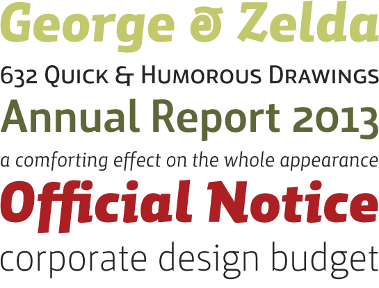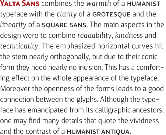
For Stefan Claudius, working on a new font is like undertaking a research project in that he investigates and explores where various graphic ideas take him. Hence, the creative process for Yalta Sans began with him examining the effect of taping lines within a Grotesque-style font. For its final form, the designer decided to incorporate contrasts in terms of line thickness which, in his words, “you can only feel rather than actually see”. The result is a clearly apparent Humanistic quality that sits happily with the otherwise more formally contained profiles of Yalta Sans.
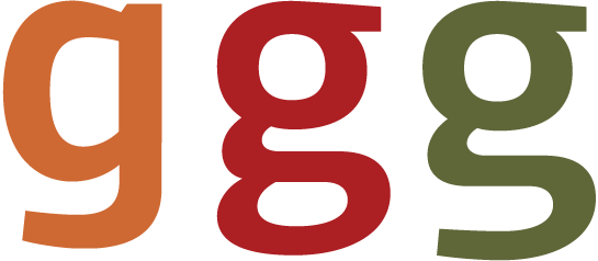
The font is provided with additional dynamism by conical finials, for example on the feet of the “b” and “d” and the upstroke of the “n” and “p”, and minimally bevelled line terminals. In addition, the rounded foot of the “l”, the slightly diagonal stems of the “M”, the serifs of the “i” and “j” and the rounded punctuation marks and tittles counteract any tendency of the font to appear too inflexible. The lowercase “g” is in the single-storey form characteristic of Grotesque fonts but the double-storey variant more usually seen in Antiqua-style typefaces is available in two varieties in the alternative glyph set.

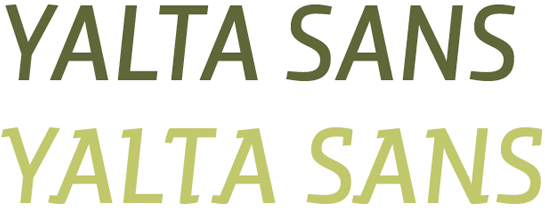
In the case of the italic, Claudius has preferred to reproduce the genuine cursive of an Antiqua font rather than the inclined italic of a Grotesque. Many of the letters of Yalta Sans Italic are ornamented with distinctive upstrokes and downstrokes. The lowercase “a” is closed and the “f” has a descender. As a special feature, Claudius has designed a second set of uppercase italic glyphs. Here he has again adopted the substantial upstrokes and downstrokes used in the lowercase letters and moves even closer in design terms to an Antiqua-style font, imparting to Yalta Sans an almost calligraphic texture.
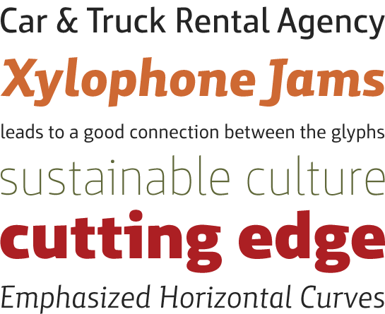
With its eight carefully harmonised weights ranging from Thin to Black, Yalta Sans is ideally suited for use in text and display applications. Sets of numerals in the form of both lining and oldstyle figures together with small caps round off the range of glyphs on offer.
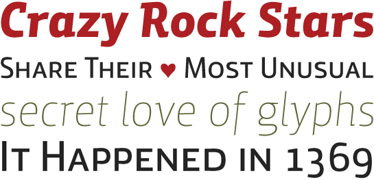
Stefan Claudius has deftly modified the formal and technological character of a square sans to create Yalta Sans. Its bevelled finials seem reminiscent of the flow of calligraphic strokes and its tapering horizontal lines give the font considerable dynamism.
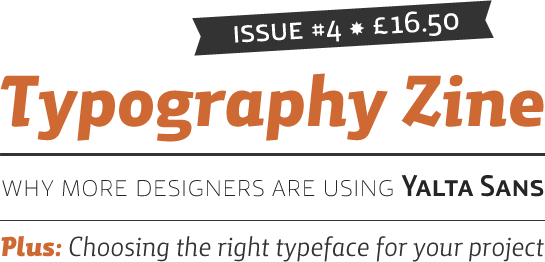
The extensive array of glyphs provided, its self-contained nature and its clarity both in print and on the screen make Yalta Sans the ideal partner for use in corporate design. Not only this, but the typeface conveys values which, as Stefan Claudius points out, are important to many businesses: a human approach and an affinity with technology.


 For Stefan Claudius, working on a new font is like undertaking a research project in that he investigates and explores where various graphic ideas take him. Hence, the creative process for Yalta Sans began with him examining the effect of taping lines within a Grotesque-style font. For its final form, the designer decided to incorporate contrasts in terms of line thickness which, in his words, “you can only feel rather than actually see”. The result is a clearly apparent Humanistic quality that sits happily with the otherwise more formally contained profiles of Yalta Sans.
 The font is provided with additional dynamism by conical finials, for example on the feet of the “b” and “d” and the upstroke of the “n” and “p”, and minimally bevelled line terminals. In addition, the rounded foot of the “l”, the slightly diagonal stems of the “M”, the serifs of the “i” and “j” and the rounded punctuation marks and tittles counteract any tendency of the font to appear too inflexible. The lowercase “g” is in the single-storey form characteristic of Grotesque fonts but the double-storey variant more usually seen in Antiqua-style typefaces is available in two varieties in the alternative glyph set.

 In the case of the italic, Claudius has preferred to reproduce the genuine cursive of an Antiqua font rather than the inclined italic of a Grotesque. Many of the letters of Yalta Sans Italic are ornamented with distinctive upstrokes and downstrokes. The lowercase “a” is closed and the “f” has a descender. As a special feature, Claudius has designed a second set of uppercase italic glyphs. Here he has again adopted the substantial upstrokes and downstrokes used in the lowercase letters and moves even closer in design terms to an Antiqua-style font, imparting to Yalta Sans an almost calligraphic texture.

 With its eight carefully harmonised weights ranging from Thin to Black, Yalta Sans is ideally suited for use in text and display applications. Sets of numerals in the form of both lining and oldstyle figures together with small caps round off the range of glyphs on offer.
 Stefan Claudius has deftly modified the formal and technological character of a square sans to create Yalta Sans. Its bevelled finials seem reminiscent of the flow of calligraphic strokes and its tapering horizontal lines give the font considerable dynamism.
 The extensive array of glyphs provided, its self-contained nature and its clarity both in print and on the screen make Yalta Sans the ideal partner for use in corporate design. Not only this, but the typeface conveys values which, as Stefan Claudius points out, are important to many businesses: a human approach and an affinity with technology.
