Photo by Pelle Anderson
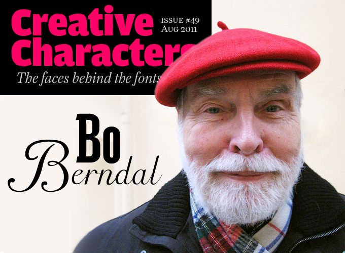
In recent months we’ve been on something of a tour around northern Europe. We’ve taken in Sweden, Siberia, the Netherlands, Germany and now, with another sharp turn towards the top of the map, we’re back in Sweden to meet someone whose enthusiasm for getting in early with the latest technology is matched only by his immersion in the historical techniques of broad nib and black ink. A recent flurry of releases, published through the Stockholm foundry T4, belies the conventional idea that retirement equals a quiet life. Born in 1924, Bo Berndal is now in his seventh decade of typographic activity, resulting in over 200 published typefaces. Amazingly — or perhaps not — making type is still his favorite pastime today.
How did you get into the printing business?
As a boy I dreamed of being a car mechanic. In 1939 I got a job at a place selling used cars, driving second-hand Duesenbergs, Alfa Romeos and Bugattis, but by September, when World War Two started, it was all over. I looked for a new job, and became an errand boy in a small printing shop. The regular workers in my print shop were soon forced to become soldiers, for which I was still too young; so before too long I was learning to set type by hand. I was at the age of devouring books, and one of them was Tarzan of the Apes, in the Swedish translation. Oddly enough I recognized that book, although I had never read it before. After a while I found out that it had the same typeface I worked with every day — Genzsch-Antiqua. This was a whole new experience for me — finding out that there must be various letterforms.
A German refugee who also worked at the shop gave me a small book from 1931 called Handbuch der Schriftarten (“Handbook of typefaces”) with the word “Hamburgerfons” printed on page after page in different fonts at 24 points, with the designer and manufacturer in 8 points size. From that point on I was a “typoholic” — I can never start to read a book before I know what the typeface is.
Being a type designer was probably a rather exotic career choice in Sweden in the 1940s. How did it happen?
From 1947 I began sending self-designed Christmas greetings to more and more people every year. And every year I received replies from two famous people, the president of the USA and the pope in Rome. “The President (or Holy Father) asked me to thank you for your kind and thoughtful message.” (It seemed to me they had the same copywriter.)
In early 1950, in reply to my 1949 Christmas card, I was invited to become type designer at Typmatriser AB (TYMA), a company that produced matrices for Linotype machines. They had received a commission for a newspaper typeface, and I got the job to do it. One of the other results of our collaboration was Tyma Garamont. The digital version is now at T4, available from MyFonts. Garamond was the most popular typeface in the middle of the last century, and almost every typefoundry had its own version. The owner of TYMA preferred the Garamond from the Stempel foundry. I believe he wanted his version to be better than theirs.
These typefaces were designed for double Linotype matrices. The roman and the italic of a letter were on the same matrix, so the roman lowercase f had to be combined with the italic f and both had to have the same width. That was hard work.
Could you describe the process of designing a typeface in the 1950s?
When making a typeface at TYMA, I would start out by drawing each letter free hand on A4 graph paper. Then I put a 2-millimeter-thick celluloid sheet on top of it, and cut around the edges. I glued the celluloid letter to a masonite plate, from which it was transferred by Pantograph to a patrix, or punch, of steel. The patrix was then used to stamp the matrix.
In 1959, I did indoor and outdoor sign lettering for Åhlens department stores. I drew them with a compass and ruler, and colored them with black ink. My idea was that the letters would be cut out of white plastic and mounted on brown plastic boards. One day when I was at the store, I discovered that in several places the As were facing in the wrong direction: they had mounted them back-to-front. When I pointed that out to one of the plate fitters, he became furious and told me that I shouldn’t stick my nose into an experienced professional man’s job. After a few years, the company considered that the handling of the loose letters became too costly and went over to screen-printing white letters on brown plates.
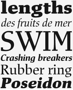
Mixtra Roman & Sansserif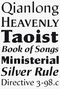
Mixtra Roman, together with its siblings Sansserif and Slabserif (see below), is a practical utility text face with some pronounced characteristics intended for effective reading in small text sizes, such as the squarish, chiseled out counters. Those same features might well pique the interest of designers who like to exploit those odd shapes for making dramatic headlines. Unusually, the Roman feels more like a semi-serif given that almost all its serifs are restricted to the lower half of the letter. Best suited to magazines and similar reading environments, Mixtra is a versatile choice thanks to its range of weights, including a regular small caps weight, and its three stylistic variations.
Mixtra Slabserif
Mixtra Slabserif is the third branch of the Mixtra family tree, and although its Slab terminals are only subtly distinct from the Roman in shape, they are more conventionally located at the top and bottom of each letter. This makes the overall character of the typeface different enough to add an element of contrast to captions or introductions when paired with the Roman — or vice versa.

Making type in the 1950s: drawing the letters (left) and making patterns using a Pantograph (middle and right). Photos from Berndal’s 1997 book about TYMA and the Swedish manufacture of hot metal matrices.
As a type designer in Sweden, you did not have as dense a typographic culture as you would have had in Britain, the Netherlands or Germany. Where did you look for inspiration and guidance?
Make no mistake, dear reader, there is quite a lot to take from old Swedish letters. For example: my Viker Spa was inspired by runic signs from around 1000 AD; Vadstenakursiv and Brigida took inspiration from Saint Birgitta (1300); Johabu from Johannes Bureus (1525); Olaus Magnus and Olaus Bandus from Olaus Magnus (1540); Carl Beck from Carl Beckman (1794); Läckö from an old castle in Läckö, built around 1650; Dala Text and Dala Pict were inspired by Swedish print history and folk art from the 1800s.
But my earliest inspiration was an English book: Edward Johnston’s Writing & Illumination & Lettering from 1906. I also admired his “modern” letters for the London Underground from the same period. In that alphabet, the lowercase l is curved on the bottom to distinguish it more clearly from the capital I. I did the same in Bosis.
My favorite designer is Peter Schöffer II. He worked in Basel and later in Venice. I think his first type hit was probably cut in 1512 and was uppercase only. It was used in almost every country in Europe. A later antiqua (oldstyle), probably from 1527, exists at the Enschedé Museum in the Netherlands. One book that is believed to be set in Schöffer’s typeface, is a volume titled Sabellicus opera, printed by Johann Herwagen at Basel 1538. The Swedish Royal Library has a copy that the Swedish Crown Prince Erik scribbled in. I named my version of this family Sabellicus.
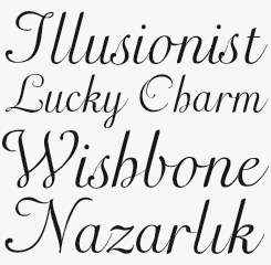
Gertrud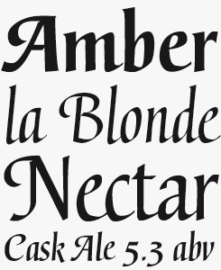
Based on lettering Berndal created for diploma certificates in the 1980s, which in turn was based on handwritten documents from the sixteenth century, Gertrud demonstrates that calligraphy doesn’t just mean elaborate swashes and intricate ligatures. When comparing glyphs from the two weights, you’ll find they have markedly different skeletons, yet are clearly the result of the same pen movement. The Bold weight is stockier, while the Regular feels more elegant.
What’s your reply to people who ask “do we really need more text typefaces?”
As far as legibility is concerned, new text faces aren’t really improving on what’s already out there, so we need new text faces for reasons other than functionality. But each era has its own concept of what constitutes “functional”: In the 19th century ease of reading was the priority, so each headline in a poster would be set in a different typeface; words were spaced very widely so that each was distinct from the other; every letter had to be identifiable so serifs were very sharp. In the 1930s, functionalism meant that the book became just a machine for reading, so everything was set in Futura. After a while, however, we became tired of everything functional looking the same, so fashion became the driving force.
The average reader won’t be able to tell the difference between Times and Palatino, but if you always use Times they will get the feeling that they’ve read something before. Just as it’s natural to long for something new and different, so it is for a girl to long for a new dress no matter how functional the old one is.
You founded the design and advertising agency BIGG (Berndal, Ingemarsson, Günther & Günther) in the 1980s, a period of dramatic change for the design profession. Were you on board with the new technologies at an early stage?
The other designers at BIGG were accustomed to working with cut and paste techniques for advert layout, so when I bought the company’s first Mac (which we called the birdhouse, on account of its size), installed Pagemaker and did all the layout, they were surprised and impressed, because there was something about the approach they didn’t understand. Later, once I had installed Fontographer, I began to experiment with drawing typefaces and soon became quite good at it. Word spread and many of my colleagues in the publishing industry came to visit and study the newest technology.
You have designed some famous logotypes for Swedish companies and organizations. What are the biggest challenges when designing a logo?
Not to copy someone else’s logo, either consciously or unconsciously. And also to give some consideration to the client’s wishes. Unfortunately, it has happened that someone has adjusted my design afterwards because a new manager did not understand the basic idea of the symbol. For example, “U” for Utvecklingsfonden (center of the top row in the image, below) now has dead straight edges instead of the little crinkly ones I had designed.
You’ve been a teacher at several institutions — what did you teach?
In the 1950s at Skolan för bokhantverk (School for Typographers) I taught apprentices to set and print proofs by hand, and to sketch simple layouts for title pages, menus and so on. In the ’60s at Grafiska Institutet (the Graphic Institute) I taught the same things to economists, managers and salesmen with little typographic experience, as well as how to do sketches so a typographer could set text without verbal instructions, how to choose a typeface, and how to specify print. Most recently, I’ve been teaching a few evening classes in broad-nibbed pen calligraphy.
Hagalind
An elegant connecting script, Hagalind is one of a batch of new fonts designed by Berndal and released by T4 in the last month or so. More modest than many of the calligraphic script fonts out there nowadays, Hagalind will appeal to users looking for an easy to use yet stylish font (advanced OpenType software not required) to use in their personal stationery or for small scale corporate identity projects. Good value.
Botobe

Another brand new release via Stockholm’s T4, Botobe is easy on the eye, a pleasure to use and, for both the normal and Italic styles, light on the purse. Will work extremely well for creating handwritten call-outs on consumer websites of all sorts — from small artisanal retailers to huge telecommunications companies.
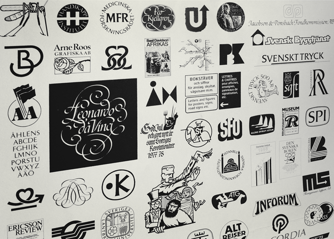
Poster by Berndal featuring some of his logo and lettering work.
You have also given regular demonstrations of typesetting and hand-printing. Was it important to you to share your knowledge, and make people aware of the tradition?
Actually, you couldn’t really call them regular, because they only occur twice a year, at the Christmas market and at the spring craft days, but I do these demonstrations alongside many other skilled professionals in authentic clothing from the early nineteenth century, showcasing their skills in the old city quarter at Skansen (the world’s oldest outdoor museum) in Stockholm.
At Skansen, to impart my knowledge of an antiquated craft was interesting for many of the visitors, and I think that for many people some historical form and spirit can add a bit of credibility to the design of a book, for example, even if they’re not consciously aware of it. Therefore, for both designers and readers, some knowledge of the history of typography can be inspiring and maybe even useful to know.
Do you like manual work? Do you sketch, draw, paint, print?
No! I only use my iMac, with Fontographer, and I am in heaven when working on the computer, drawing pictures of sound. Of course I was also in heaven when I had my Soennecken broad-nibbed pens and did my beloved calligraphy and knew nothing about the future. In the beginning sketching was necessary for me and the only way to try out forms. Now I still “sketch” but only on my iMac with many paper proofs of letter-combinations I can’t judge on the screen.
You’ve written a booklet about the Kastenbein typesetting machine, an invention that predates the Linotype machine by two decades. Could you tell us something about that machine and about your research?
In the 1950s, I happened across some remarkable old decorative forged iron panels, about 70 cm by 180 cm in size, in the attic of Officina Typographica in Skansen’s old city quarter. I asked a former colleague about them and he thought that they might belong to an old mangle.
Some years later, in 1986, as I was doing some research for an exhibition on the printed word at Stockholm’s Technical Museum, I found a notice in Nils Wessell’s History of Swedish Typographers (from 1917) about the Kastenbein typesetting machine that was used in Sweden in the 1880s. I did nothing further until July 1998 when, at the re-inaugurated Werkstatt und Museum für Druckkunst in Leipzig, I read a lyrical story about their old typesetting machines. This inspired me to return and explore several other resources about the Kastenbein (quite easily done through Google). I learned that Kastenbein machines were used by the Times newspaper in London from 1871, when they bought their first. By 1908 they had twenty-five in use, but they were replaced with Monotype machines that year.
Could the “mangle’s” old side panels be the Kastenbein’s that I had read about in Johan Gabriel Nordin’s Art of Book Printing? Unfortunately, they were no longer in the Officina’s attic, but I wrote a small booklet about the story which I attached to my Christmas message in 1998.
Batory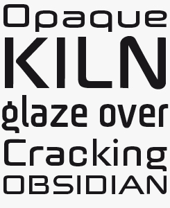
There’s a hint of the futuristic in Batory, or at least of the future as it was seen by ’80s sci-fi movie makers. Exploiting Batory’s retro-futurism will be a fun project for designers of games interfaces, fashion brands and album art. Available in three widths with a complementary Swash version, Batoswash.
Sergel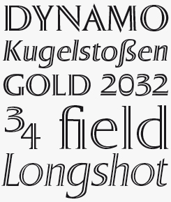
Sergel takes its name from the eighteenth-century Swedish draftsman and sculptor Johan Tobias Sergel. Lent a sculptural quality by its elegant and perfectly proportioned inline, Sergel will make for fine display and branding applications with two weights and an italic in each.
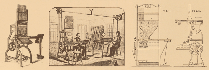
Illustrations from Berndal’s brochure about the Kastenbein machine — a typesetting machine predating the Monotype and Linotype hot metal compositors by almost two decades.
You’ve worked with printing and typesetting machines most of your life, and you are clearly at home with new technologies. Yet you’ve always practiced calligraphy as well. What is the significance of calligraphy when designing type for machines?
I think calligraphy is a beautiful art form. When I transfer calligraphy to my Mac it becomes more rigid and less varied; I can never make it look as good on the computer as it is when written freehand.
For ink, I always used to get excellent results using Ivory Black, made from elephant tusks, until making it was forbidden because elephants — thank Heavens — were protected. I tried to use other varieties, but never found a black color which was as good technically. So calligraphy became less fun. But perhaps today, the ink made of animal bones is just as good…
I really miss those days very much when it was relatively easy for me to do calligraphy for diplomas, tribute addresses and so on. My hands are not so steady anymore, and it is harder to see small details.
A small aside: it was much easier to draw on the little Mac than in my current iMac. The lines always sat in the right place and did not need to be adjusted as I am now forced to do very often. Unfortunately, my faithful old Power Macintosh 8100/110 with OS 8.6 died recently and I miss it very much because I never had any problems with it.
You are now in your mid-eighties and are using your “retirement”, for want of a better word, to design fresh-looking, digital type. Do you actually like working with computers?
Thank you! Yes, I still like working with them very much, and using a good computer gives me as much pleasure as a violinist has with his Stradivarius. All my earlier typefaces I had to sketch with a lead pencil, or draw with a broad-nibbed pen for a calligraphic effect. Thank heavens for my iMac.
What is your daily life like now?
We have lived in Bandhagen, a suburb of Stockholm, since 1959. I often listen to good old traditional jazz music. Louis Armstrong and Ella Fitzgerald have a special place in my and my wife Mari’s hearts. Now that I’m retired, I have no job to go to. But what is work anyway? I can spend every minute doing the thing I like most of all; my hobby is creating typefaces. I’m a little jealous of those designers that seem to go on and on into their old age creating excellent typefaces. ;-)
In other words, I hope I’ll be doing the same, but I have already had a very good life …so far!
Well, we’re hoping for you to keep up the pace and publish new typefaces soon (and perhaps a few old ones that still wait to be digitized). Hejdå!
Eknaton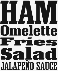
With its roots in Egyptian slab serifs, Eknaton could have been just yet another weighty monolithic headline font, were it not for the touch of dynamism imparted by the slant Berndal gave to the serifs. Across five widths, from Tight to Expanded, Eknaton will add a dash of vigorous Victoriana to posters, headlines and call outs.
Geometra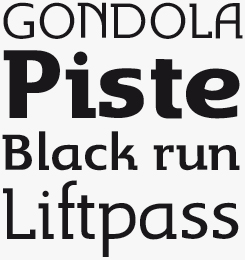
Geometra takes the modernist concept of a geometric font constructed with a pencil and compass, and combines it with the very postmodern idea of a semi-slab-serif, in the process creating a striking and distinctive typeface with great potential in both headlines and shorter texts.

Who would you interview?
Creative Characters is the MyFonts newsletter dedicated to people behind the fonts. Each month, we interview a notable personality from the type world. And we would like you, the reader, to have your say.
Which creative character would you interview if you had the chance? And what would you ask them? Let us know, and your choice may end up in a future edition of this newsletter! Just send an email with your ideas to [email protected].
In the past, we’ve interviewed the likes of Michael Doret, Laura Worthington, Jonathan Barnbrook, Rob Leuschke, David Berlow, Ronna Penner and Jos Buivenga. If you’re curious to know which other type designers we’ve already interviewed as part of past Creative Characters newsletters, have a look at the archive.
Colophon
This newsletter was edited by Jan Middendorp and designed using Nick Sherman’s original template, with specimens and type descriptions by Anthony Noel.
The Creative Characters nameplate is set in Amplitude and Farnham; the intro image features Eknaton and Hagalind; the pull-quote is set in Gertrud; and the large question mark is in Farnham.
Comments?
We’d love to hear from you! Please send any questions or comments about this newsletter to [email protected]
Subscription info
Want to get future issues of Creative Characters sent to your inbox? Subscribe at www.myfonts.com/MailingList
Newsletter archives
Know someone who would be interested in this? Want to see past issues? All MyFonts newsletters (including this one) are available to view online here.

