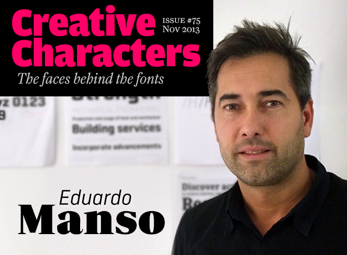
Photo by David Quay
He is not one of those type designers who produces a new font family every two or three months. Each of his typefaces has taken considerable time to mature, and it shows: they are thoughtful, original and well-wrought. Rather than responding to passing trends, his Emtype Foundry publishes fonts that are aimed at having a long shelf-life, and his Geogrotesque has been a bestseller ever since it came out five years ago. He is also prepared to pull his weight when it comes to nourishing international typographic culture — he’ll be co-organizer of next year’s ATypI conference, the world’s major annual get-together of type designers. Meet Eduardo Manso, an Argentinian who has made Barcelona his home.
|
You grew up and studied graphic design in Argentina. How did these beginnings influence your later work? Are you aware of a kind of Argentinian or Latin American approach that is still palpable in your designs? I think that in a globalized world it has become ever more difficult to speak of national identity in matters of design and typography. Besides, Argentina is a “young” country without much of a typographic tradition of its own. While we may be geographically remote, we have always been very aware of international developments. I don’t believe there is an Argentinian style, although there may be some regional tendencies. There is a certain “softness” to the Latin character which may show up in many typefaces created today. In 1994, while I was studying graphic design, I started the design magazine El Huevo together with five classmates. We were very curious and eager to acquire new knowledge. El Huevo gave us an opportunity to express our points of view on design and typography and helped us meet interesting people. In addition, as an art director, I was able to practice micro typography, to use different grids and to choose special fonts. It was the time of Multiple Master technology — I remember that I made and used several instances of Myriad — and if you were a font geek, as I was, it was a great time. All these experiences were crucial for my later work as a type designer. Was type design always something you were interested in? Who taught you how to do it? My interest grew gradually. I think it is unavoidable, when you love fonts and use them in excess, that you eventually cross the line and become a type designer. Today, when that happens, the normal situation is that you attend a school to learn how to make type. Unfortunately that wasn’t the case for me in 1994, as there were only very few schools that taught type design. So I’m self-taught; I had to learn it all by myself. It was a really long route in which the smallest discoveries seemed to be huge victories. The positive part of this process is that whatever you learn with effort and sacrifice, you never forget. In 2000 you moved to Barcelona, Spain, where you are still located. What motivated your move to Europe? Did you plan to stay there so long? In Argentina I had a good job in an advertising agency, but I felt that my professional life didn’t make sense. I had started to make fonts in a more serious way and, as a graphic designer, I needed to go back to the origin of design and make more editorial stuff and fewer adverts. So I came to Europe to work in a small studio in Barcelona for a couple of years, gain some experience, and then return to Argentina. I chose Barcelona because it is a city where design has an impact on many aspects of life and because I had some friends here. Barcelona is one of the world’s design capitals. Over time I fell in love with the city and I ended up staying. Although I’m not ruling it out, I have no plans to return to Argentina in the near future. Now I have a child who was born and is growing up here, a lot of friends and, as if that wasn’t enough, the weather is incredible (we have six months of warmth). The truth is that I have more and more links with the city, I’m almost at the point of no return. |
Geogrotesque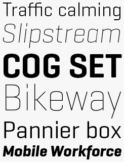
Manso attributes Geogrotesque’s enduring success (it debuted in 2008) to its basis in a simple modular form, with just enough personality to impart some warmth to its otherwise technical flavor. That warmth means that there is much more to Geogrotesque than the “computer aesthetic” familiar from console game and dance music packaging of the ’90s and early ’00s, and the typeface’s release in 2008 could mark the point when digital style became indistinguishable from mainstream design. Geogrotesque Stencil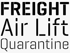
The three versions of Geogrotesque Stencil are designed to overcome some common problems found in stencil fonts, principally gaps that are either too wide or too narrow for the point size of the text. The rule of thumb: use the fonts with the narrowest gap (Stencil A) for larger settings, and those with the widest gap (Stencil C) for smaller settings. Seven weights of each version make this stencil more flexible than most of this genre. |
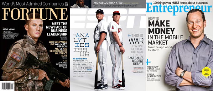
Geogrotesque used on the covers of the magazines Fortune, ESPN and Entrepreneur
|
Like many type designers of your generation, you started out with grungy, distorted fonts based on existing typefaces, such as ITC Merss and Eroxion. It’s not the kind of practice we have much patience for nowadays. Do you feel inclined to reject that early work? Umm… yes, if I could go back in the time, I wouldn’t do those kinds of fonts. But I can’t, and I have to live with that. So, no complaints. Those fonts were a part of my learning process, of my approach to the tools and methodologies. In fact, I learned a lot from doing so, but nowadays I try not to let my students make the same mistakes. The fact that you can publish a font does not mean that you can publish whatever. The most important thing that a type designer has is their reputation, so it is better to wait and publish when you are absolutely sure about your typeface. It is the philosophy that I follow now and I believe. Likewise, sometimes I think it is necessary to talk about my early fonts with my students, from the point of view of the learning process, mostly because students get frustrated when their first alphabets are not perfect. No one makes a perfect font on their first attempt, it takes time and effort. I started doing grunge fonts, then modulars and I ended up doing text fonts. It was a long process, and it took me a long time to learn how to make good fonts. How did you manage the leap in quality, in just a few years, to such well-made faces such as Bohemia and Relato? I always try to create original fonts that are still usable, which is quite a difficult task, especially now that all type categories are so well-represented. Ten years ago it was easier to find unexplored paths. But the leap in quality came after I had tried out all the shortcuts with my experimental fonts; I thought that it was time to try something different: I chose the long way. So, the exercise was to try to do things by the longest way possible, avoiding all shortcuts. For instance, drawing a bold by hand in FontLab without any automatic interpolation. When you accept that designing a font is a long term activity, all becomes clear. It’s normal to spend several days drawing a ‘g’ or a ‘s’, and it is also normal that three months later you no longer like it. So, we need time to design, time to leave it in a drawer, time to go back to it and finally time to redraw it over and over. It is the long way. |
Periodico Display & Text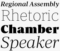
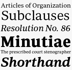
Periodico (Spanish for “newspaper”), was originally commissioned by the Spanish daily ABC. Like many news faces it took its inspiration from letterforms created in the late eighteenth century — in this case, typographic engravings from Spain. Rather than making a revival, Manso used these sources merely as a reference to create a family that is fresh and distinctive, yet very functional. The result is a versatile text and display family in 30 styles: 10 for text (from Light to Bold) and 20 for display sizes (from Thin to Ultra Black) — an extensive type system capable of solving all the needs of a complex publication. |
|
You released your earlier fonts with various large foundries: ITC, T-26, Linotype. What prompted you to start your own company, Emtype Foundry? Having published fonts at a number of existing foundries, I found that the benefits were very limited. Besides, starting up my own foundry was also a way of marking the “before” and “after” in my career as a type designer. My beginnings were a bit erratic, so when I finally found my own approach to type design, I wanted to insert a punctuation point in my professional life. I set up Emtype Foundry and now I only publish “serious” fonts — it doesn’t matter if it is for display or for text, but serious. The principal motivation for my foundry is to always think twice before publishing something new. Geogrotesque, released in 2008, was one of the best-selling contemporary fonts to date on MyFonts. Were you surprised? Did the success give you the freedom to do things that weren’t possible before? Once I had done several font families, I started to realize that I didn’t like to use my own fonts. I mean, use them more than once or twice. I spent a lot of time wondering to myself why. And I came to the conclusion that, as a graphic designer, I liked simpler and more usable fonts — that is, more versatile fonts. I never planned to do a bestseller, in fact I’m against type designers who make fonts with the “bestseller list” in mind. So, Geogrotesque was born to answer my own question. I’m really proud of it because it’s simple but has a bit of personality, just enough to be original, but not so much as to be unusable. Proof of its versatility is that it is used around the world, in a wide range of brands, products, publications, apps, etc. Among others it has been used by Fortune magazine, ESPN magazine, Lincoln, PUMA, Standard and Poor’s, and so on. Coming back to your question then; yes, I was pleasantly surprised, but happy. The fate of any font is that it is used, so, type designers should be happy when this happens. The success of Geogrotesque gave me the freedom to just work on interesting projects, and since then I have been working non stop. Now I feel an extra responsibility, for example I’m working on Geogrotesque Condensed and it is a huge challenge, it must be perfect. The name Geogrotesque gives me an extra pressure to do my best — for instance, I have discarded several versions because they weren’t good enough. |
Bohemia LT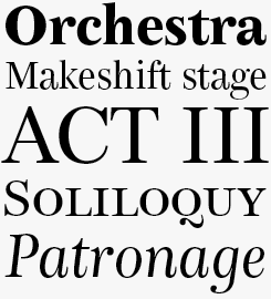
Bohemia LT isn’t a historical revival so much as an an evocation of late-nineteenth styles and fashions — the vertical stress of a didone is very evident, as is the swooping contrast and irreverent flourish of a Clarendon. Intended primarily for editorial use, Bohemia LT will adapt well to settings in both text and display sizes. Dixplay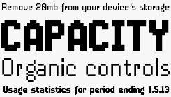
Inspired by the aesthetics of ’80s video gaming, Dixplay is a grid-based pixel font, intended for web and multimedia projects and optimized for setting at 20px (as it is in the upper and lower lines of our sample, above) but don’t let that stop you using it larger and in print if you wish — it will work perfectly well there too. |
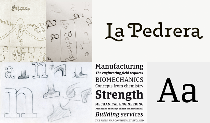
Top row: Logotype for La Pedrera, Antoni Gaudí’s emblematic Barcelona house, a modernist-minimalist logotype under the art direction of Mario Eskenazi. Designed in 2013. Bottom row: Process sketches for Catalana, a custom font originally designed for an insurance company, which will be published in 2014.
|
Some independent type designers publish several font families each year. Your pace is slower: between releases, there are sometimes two years or more. Why is that? I’m focused on the quality; I know that every designer says the same, but I simply think it is impossible to publish a quality font family every month. In my foundry the processes are long, I definitely take my time, usually years. It is the sum of several factors: firstly, for my own creations I have the need to experiment with different solutions, try many possibilities, until I arrive at a new place where I could never have arrived without experimentation. I’m very rational, so I always try to balance this with a bit of experimentation. Secondly, I need to leave every font family to breathe for a time before I make a final decision about its publication. Finally, between my own releases I have to make fonts for clients. The good news is that I have two upcoming font families. The first one is a slab serif that was originally commissioned for an insurance company here in Spain. Now I’m expanding the family to make it suitable for a larger audience. The second one is a square sans, slightly inspired by UK car license plates. The idea came from my first trip to London in 2008 — five years and five trips to London later, I’m very close to finishing it. With this family I’m taking all the time in the world. When you play in an over saturated category, like square fonts, you have to put an extra emphasis on the technical and aesthetic quality with the purpose of differentiating it from the rest and, in the end, to make sense of its existence. Your latest family, Ciutadella, was originally commissioned by the prestigious Barcelona studio of Mario Eskenazi. Is it an advantage for a type designer to receive assignments? Doesn’t it limit your freedom? And does it happen often? Apart from being a client, Mario has become a friend. We meet very often to talk about type and life in general — I can totally identify with his vision of design. Working with great graphic designers is always lucky. You learn a lot from them, and in that sense I try to take advantage of every minute that I spend with them. I like to speak about what is a good typeface and why, or why they prefer one or another. I think that type designers should speak more with graphic designers to have a broader vision of the users of our fonts. A brief doesn’t limit my freedom, the function of it is to show you a path or the parameters you should design the typeface within. I take it as a guide and if I have doubts I speak with the client and sometimes we adjust the brief. I have done several custom fonts, for example for The Sunday Times (UK) newspaper and the ABC (Spain) newspaper. Last year I did a custom font for a Spanish insurance company; a Geogrotesque customization for one of the biggest German airports; and a custom font for use in the 2014 World Cup in Brazil for a very well known sports brand (the three projects will be made public in 2014). In addition, I have done lettering and logotypes under commission. It is a normal situation. I work more comfortably with a brief than without. Even for my own fonts I have an “self brief”: it is essential to have a guide that leads your design. Moreover, as a rule, I reject restrictive briefs, I think clients must trust the professionals they hire. In my case, I have been lucky so far, I have worked with amazing professionals that gave me the space to work with freedom. In October of this year, it was announced that you and your colleague Andreu Balius will be organizing next year’s conference of the world-wide typographic organization ATypI. I think it’s very courageous for independent designers to invest a year of their lives into setting up such a big event. Why did you volunteer? Andreu and I have been sharing the ATypI Spain delegation for a while and we had spoken about doing something to propel ATypI in Spain and to play a more proactive role, and when the opportunity to organize the ATypI congress 2014 appeared, we simply thought it was something that we have to do. It’s a way to contribute to the development of our profession. Yes, we know that is a lot of work, but fortunately there are many people who want to help us to achieve an unforgettable congress. Now, Laura Meseguer is on board too and more people are coming. Andreu and I had already helped in the organization of the AGI Open and AGI Congress in 2011, so we thought that at least we are not absolute beginners. A lot has changed in (typo-)graphic education in the twenty years since you began your studies. What would your advice be to today’s students when they realize they’ve been bitten by the font-and-lettering bug? Unfortunately, there is no cure. The good news is that nowadays there are a lot of places to learn type design, so my advice would be: Take it seriously and go to one of these type design schools in order to learn it in an academic way. It’s faster and you will avoid all my initial mistakes. Be prepared to work hard, study is just the first step: to master type design completely could take your entire life, and learning is a never ending process. Finally, don’t waste your time copying other people’s work. Forget about trendy fonts, a thoroughly designed font family will outlast changing trends. Finding your own way is much more exciting and rewarding. Eduardo, thanks for your wise words! |
Ciutadella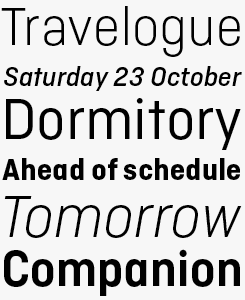
Manso has collaborated frequently with Mario Eskenazi’s studio, a major Barcelona design company. They originally commissioned the typeface that became Ciutadella, a versatile geometric sans serif in a simplified style reminiscent of DIN. Its “open” personality makes it suitable for a wide range of uses, from identity systems to publications. Although conceived as a display typeface, it performs well in intermediate-length texts, too. Ciutadella includes many Open Type features such as alternate characters, special ligatures and multiple numeral sets. Relato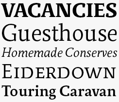
Relato Sans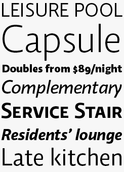
Relato draws on a range of classic typographic sources to create a robust, contemporary text typeface. Its lowercase forms are humanist in their construction, while its capitals owe more to Roman renaissance lettering. The family is composed of three weights with an italic and small caps provided in a separate font. Relato Sans has fewer idiosyncrasies than its companion serif family, but with a fuller complement of weights this humanist sans is a useful if utilitarian workhorse. |
MyFonts on Facebook, Tumblr & TwitterYour opinions matter to us! Join the MyFonts community on Facebook, Tumblr and Twitter, — feel free to share your thoughts and read other people’s comments. Plus, get tips, news, interesting links, personal favorites and more from MyFonts’ staff. |


|

|
Who would you interview?Creative Characters is the MyFonts newsletter dedicated to people behind the fonts. Each month, we interview a notable personality from the type world. And we would like you, the reader, to have your say. Which creative character would you interview if you had the chance? And what would you ask them? Let us know, and your choice may end up in a future edition of this newsletter! Just send an email with your ideas to [email protected]. In the past, we’ve interviewed the likes of Matthew Carter, Laura Worthington, Jonathan Barnbrook, Ulrike Wilhelm, David Berlow, Emily Conners and Hannes Von Döhren. If you’re curious to know which other type designers we’ve already interviewed as part of past Creative Characters newsletters, have a look at the archive. |
ColophonThis newsletter was edited by Jan Middendorp and designed using Nick Sherman’s original template, with specimens by Anthony Noel. The Creative Characters nameplate is set in Amplitude and Farnham; the intro image features Ciutadella and Periodico; the pull-quote is set in Periodico Display Light Italic; and the large question mark is in Farnham. |
Comments?We’d love to hear from you! Please send any questions or comments about this newsletter to [email protected] |
Subscription infoWant to get future issues of Creative Characters sent to your inbox? Subscribe at www.myfonts.com/MailingList |
Newsletter archivesKnow someone who would be interested in this? Want to see past issues? All MyFonts newsletters (including this one) are available to view online here. |

