
photo by Jan Middendorp
This month marks the second anniversary of our acclaimed series of interviews. Thank you all for your compliments and encouragements! We celebrate the event with a lengthy interview conducted in French (don't worry — we did translate it)…
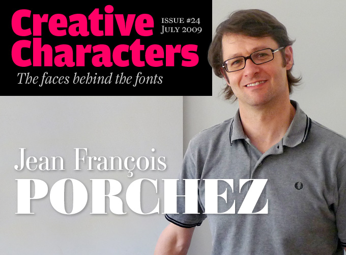
Ever since he vaulted onto the type scene fifteen years ago with a series of widely visible and award-winning typefaces, Jean François Porchez has been among the most prominent type designers in France. He designed custom type for clients ranging from the Baltimore Sun to Louis Vuitton and the Paris Métro, and drew some of the best-known logos in his country. He has been with MyFonts since our first year and has recently made available several more of his spectacular font families. Meet Jean François Porchez, our man in Paris.
Jean François, shall we start at your beginnings?
Sure. My first serious encounter with type took place in the late ’80s when I was studying graphic design at a school called EMSAT. We had a guest teacher there named Ronan Le Henaff, who had been a trainee at the ANCT in Paris, a school specializing in type design — I’ll get to that later. He introduced me to calligraphy and type design and made me realize that there were other career paths beyond graphic design or advertising. All the kids in my school wanted to become illustrators or art directors; nobody was seriously interested in type. So I thought: hey, here’s my chance to do something special. When you start studying you want to be different. To choose type design was, at that time, pretty extraordinary.
There was another important reason. My mother ran her own bookshop; my father, who was in politics, had this huge library which, for example, included the complete collection of the famous literary review Les Temps modernes. A very French, very intellectual background. Type design was a way to reconnect to that culture of the book and do it on my own terms. I liked that.
What did the French type world look like when you came out of art school?
At the time, the dominant tendency was a calligraphic one. The most influential school was in Toulouse, in the South of France: the Scriptorium de Toulouse founded by Bernard Arin. In Paris, a group of type specialists named CERT had persuaded the Ministry of Culture in 1985 to found ANCT, the Atelier National de Création Typographique, in an attempt to revive type design and technology in France. The sector had been in dire straits ever since the demise of the Deberny & Peignot foundry in 1974. During the first years of the ANCT (which later became ANRT and moved to Nancy), José Mendoza and Ladislas Mandel were important teachers, as was Albert Boton. Early trainees included Franck Jalleau, Jean-Renaud Cuaz and Thierry Puyfoulhoux — an entire wave of young type designers whose view of type was based on handwriting.
I studied at the ANCT for a year. But as I already knew how to design type (I had made my first typeface, Angie, while at the graphic design school), I didn’t learn much. At one point I took a week off without telling anyone to visit the Scriptorium de Toulouse. That’s where I started my second typeface, Apolline.
Meanwhile, your international career had already taken off…
I soon felt that there was not a lot of room for me in the French type scene. The main positions were taken, and in Paris there was a kind of clan that you were or were not part of — and they had a tendency to reject you if you weren’t. So it was natural for me to look abroad.
Contrary to many French designers, I always had a strong interest in what was happening elsewhere — in the English-speaking world or in the Netherlands. One book that introduced me to international type culture was Sebastian Carter’s Twentieth Century Type Designers, a great didactic collection of short biographies that taught me a lot about the history of type design, about the various cultures and influences. I was also fascinated by the writings of John Dreyfus and Lawson’s Anatomy of a Typeface.
So right after finishing the first version of the Angie typeface, even before I enrolled at ANCT, I tried submitting it to various international type foundries. It wasn’t accepted, but it won a special prize at the 1990 Morisawa Awards in Tokyo, the Brattinga Prize.
I began frequenting the Rencontres Internationales de Lure, a yearly type conference in the south of France. I got on very well with its organizer Gérard Blanchard, who was a man of great culture — and a kind of mentor to many young designers at the time. At Lure, I met people like Matthew Carter, FontShop’s Jürgen Siebert and people from Agfa. These contacts would eventually lead to the publication of my earliest typefaces at various international foundries.
Parisine

Porchez designed Parisine in 1996 for the Paris transport authority RATP with the specific purpose of improving the legibility and ease of use of the public transport signage system. In 1999, the family was revised and extended for use in maps and external communication. Bold versions are available as Parisine Sombre, lighter versions as Parisine Clair.
Parisine Plus

Parisine Plus is a playful variation on the Parisine typeface, designed independently from the series of custom fonts developed for RATP. Parisine Plus was meant to be a reaction — a kind of self-criticism — to the functionalist objectivity of Parisine. While Parisine tries to embody neutrality (a very relative term, in fact) Parisine Plus has fun with contrasts and ornamental details that are not so obvious for a sans-serif family. Check out the set of charming heavy-set variants called Parisine Plus Sombre. Parisine Plus Clair includes lighter weights.
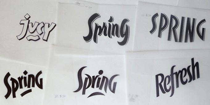
Hand-rendered logo proposals by Jean François Porchez for a branding project at Dragon Rouge (1992).
In the mean time, what did you do to make a living?
At a certain point I was ready to cross the Channel to work at English Monotype. It didn’t happen, for a number of reasons. Instead, I found a job at Dragon Rouge, a Paris design agency specializing in packaging and corporate identity. Remember that in the early 1990s computers and software were not as accessible as they are today, and there were hardly any independent type foundries. In France, working at a packaging agency was the best option if you wanted to make a living designing type. At Dragon Rouge I did a lot of hand-lettering — it enabled me to draw letters all day. Most importantly, it helped me to break away from calligraphy. When you work at a packaging design company, you have to propose a wide variety of forms all the time, which opens up you mind and pushes you to make new discoveries. I stayed for three years. By then I had realized that letterforms do not necessarily have to evolve from the chancery script or the renaissance roman.
Working at Dragon Rouge also introduced me to the computer. There were just three Macs at the studio; I got to use one of them. With my own money I bought the type designing system Ikarus-M, which I installed on their computer. I preferred Ikarus to Fontographer — which I discovered later — because it was better for digitizing drawings on paper.
How did you make the transition from working at an agency to being an independent type designer?
I was always looking for opportunities to design type. In April 1994 I read an article in Le Monde, a major French daily, by the new editor-in-chief Jean-Marie Colombani. He announced that later that year there was going to be a major overhaul of the paper’s design. So I decided to make them a new typeface: a drastic reworking of Times New Roman, which was their current typeface, optimized for French and for current technologies. In July I wrote to the editor saying I wanted to propose a new typeface to suit the newspaper’s new formula. A typeface made for the French language, respectful of French culture. I mentioned that it might be high time to replace Times, which had originally been designed for a conservative, royalist English newspaper. Of course I knew that Le Monde, with their independent, politically committed stance, would be sensitive to that.
Le Monde agreed to receive me, I did a big presentation and at the end of it they said “Banco!”, which in French means, “OK, go for it!” They were in a hurry. They asked me to design three weights during my August holidays. So after a month of hard work at Corsica, carrying my very first notebook computer, I submitted three fonts for testing in September. They gave me the definitive go-ahead a couple of weeks later, and within a week I’d quit Dragon Rouge. After that, I made them one weight each week, eight series including serif and sans-serif versions.
AMBROISE

The Didot family of typefounders and printers were pioneers in what came to be know as “Modern Face” — the neoclassical style of vertically contrasted typefaces. Designed in 2001, Ambroise is a contemporary interpretation of various types belonging to the late Didot style. It borrows some of its peculiar details from typefaces conceived circa 1830 by the Didots’ punchcutter Vibert. The family’s conception was based one the Black weight. Fat Didot faces in several widths could be found in the catalogs of French type foundries from the mid-19th century until the demise of the great French foundries in the 1960s and 1970s.
Each variation of the typeface carries a name in homage to a member of the illustrious Didot family. The condensed variant is called Ambroise Firmin. The extra-condensed is called Ambroise François.
You never yielded the Le Monde typeface’s copyrights to the paper and you negotiated the right to publish it yourself after some years. It takes considerable business acumen for a budding designer to insist upon that kind of clause.
I’d talked to some very experienced designers, like Sumner Stone and Matthew Carter, and also Ladislas Mandel in France, who had designed phonebook typefaces for major telephone companies. They made me understand that the best option was to give them a discounted price in exchange for a limited exclusivity period. In France, type design is part of copyright laws; copyrights are unalienable, and protected until 70 years after the death of the author. If you have that kind of protection, why not benefit from it?
From 1995 onwards you were an independent type designer, publishing your typefaces at different companies: FF Angie through the FontFont library, Apolline at Creative Alliance (Agfa-Monotype), Anisette at Font Bureau. You obviously didn’t want to put all your eggs in one basket.
I wanted to be independent right from the start. It is a bad idea to have all your fonts with just one publisher. A colleague of mine had published several fonts at a German foundry which then folded and was taken over, and in the process he lost all his royalties. I soon realized that even with the most respected foundries, you never know what may happen to them. That’s why I’ve always advised younger designers to diversify in order to better protect their rights, and have a broader range of options from a marketing point of view.
Angie Sans

Angie Sans is the sans-serif version of FF Angie, Porchez’ first typeface. Angie Sans is a “glyphic” face in the tradition of Optima and Pascal, and has the elegantly tapered stems of that rare genre. It was given optimum legibility at text sizes by keeping letter shapes open and distinct from one another. Thanks to its subtle detailing, it is also a striking headline face for advertising and magazines. The Italics are lighter, narrower and more flowing than the romans.
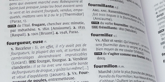
Porchez designed the covers and the typography of Larousse’s series of Grands dictionnaires using Le Monde Journal and Le Monde Sans.
You soon decided to start up your own foundry, Porchez Typofonderie. When did that happen?
Let’s see… I discovered the internet in 1996, took my domain name in early 1997… I had my first website up in the summer of 1997. It was a hassle to have a website hosted in France at the time, so I went to a Canadian provider that was also used by my colleague John Hudson.
In the beginning I worked without any distributor at all, just selling to customers directly. Kind of crazy when you think about it. It was my way to safeguard quality and be independent. I even withdrew a couple of typefaces from one of the foundries I worked with because they didn’t operate in a correct way. I saw the royalties diminish each month. It turned out they were calculating the percentage not based on turnover but “after marketing”, which is, of course, impossible to check. It was disrespectful of the rights of the designer, so I left. I did embark on the MyFonts adventure from the very start, though with only two font families.
For almost ten years, I was radically against working with distributors, in order to have total control over my work. I changed my attitude a couple of years ago. After many discussions with people in the business, I’ve become more open. I’m distributing through FontShop and I’m making more and more stuff available through MyFonts.
Pirating has always been one of my concerns. But I realized that you’ll always have a certain percentage of leakage through pirated fonts. Whatever your sales volume, the ratio is more or less the same. So it’s better to open up instead of trying to seal yourself off.
Let’s touch on the creative aspects of your work. How would you summarize your philosophy of type design?
The main task of a type designer is to enable people to read a text. So the letters have to be readable. This may mean — and for a long time I exclusively took that approach — that you use open letterforms of a humanistic character, related to writing. You pay a lot of attention to the rhythm, the frequency of particular signs in particular languages, the varying widths. You shouldn’t borrow too many details from calligraphy, the way I learned it in the beginning, but mainly the force and the flow and the structure of writing.
When I do a piece of lettering using new letterforms, for example, I try not to concentrate on the effect but on what’s behind it, on the inner workings of the alphabet. Open up the counterforms — the “white” of the letters — which has always been a focus of pragmatic type designers such as Gerard Unger or Ladislas Mandel. It relates to a philosophy of making things accessible.
I think this practical aspect of usability is crucial to type design, even when working from an historical model. When I’m working on a Baskerville revival like Henderson Serif, for instance, I’ll open up the counters to improve legibility, I may accentuate the diagonal stress. I don’t just scan a typeface and digitize it respectfully. That’s more or less the approach you find a lot in North America; I think that from a design perspective it lacks the added value which you may find in revivals that have been made the European way. I think it’s not so interesting to just take old letterforms and adapt them to a new technology. You can leave those typefaces alone, they’re fine where they are. You have to come up with new elements.
Le Monde Journal

Le Monde Journal is the typeface on which the entireLe Monde family is based. By definition, it is intended for newspaper use and at small sizes. As it was designed to replace Times New Roman, it has the same typographic “color”. Yet it is distinctly different in its detailing, being optimized for a more fluent reading flow. The counters in the glyphs are large and open, as if they illuminate the letters from the inside. To meet the challenges of newspaper printing, the Bold sharply contrasts with the Regular, while the Demi weight is better suited for titling. Le Monde Journal was designed in 1994 as the text face of the daily Le Monde and was used by that newspaper for over ten years.
Le Monde Sans

Le Monde Sans was designed in 1994 and was derived from the serifed family — a practice that has now become commonplace. A compatible yet distinctive sans-serif companion typeface is a great way of enhancing typographic possibilities. This is fundamental in editorial design, where comments and analyses must be subtly distinguished from the actual news items. The design of Le Monde Sans follows the proportions common to the entire family, which allows the designer to effortlessly combine and alternate these subfamilies within the composition.
Your own revivals, such as Sabon Next — based in turn on Jan Tschichold’s Sabon, a Garamond revival — and Ambroise have been criticized for taking too many liberties.
I’m aware of that, and I’m quite comfortable with it. I’ve consciously taken on the task of adding something meaningful that befits our times. We have our own experiences and our own culture, with its reading habits and printing technology. We have to interpret forms in our own way, which will necessarily be different. You can criticize it and comment on it — fine. But it’s added value. Is it better or not? That’s for the critics to decide.
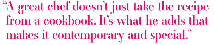
It’s a bit like haute cuisine. In a good restaurant, they don’t cook a Boeuf Bourguignon just like that. They interpret the dish in a creative way, maybe adding some oriental flavors… that’s what constitutes the work of a great chef. He doesn’t simply take the recipe from a cookbook. It’s what he adds that makes it into something contemporary and special.
Could you describe your steps when you begin a new typeface?
The first thing I do is to formulate a challenge that is different from others — if it’s possible. When I make a custom typeface for a client, he is not going to tell me exactly what to do, because he’s not a type designer. So I often need to write my own brief stipulating as many constraints as possible in order to give the design a certain direction and a force of its own. I’ve found that writing a brief is especially useful when working with a graphic design agency. Graphic designers have a lot of expertise when it comes to symbols and colors and figurative connotations; but they’re often at a loss when they’re faced with a series of black abstract forms like an alphabet. So you have to give them a parallel road to arrive at understanding why this or that shape has a specific evocative power.
For instance, when I designed the corporate typeface for France Télécom’s new identity in 2000, their brief was to develop an alphabet which evoked both technology and the human aspect. They had gone from being a company that sold stuff — machines, hardware — to selling communication between people. My way of translating that was to combine round forms and angular forms within the letters. You also found that in a lot of French car designs at the time: Twingo, Mégane, Kangoo; there was a Ford Focus across the street from my studio that had similar characteristics. So… you have to create a visual concept.
In general, working for a client is always better. You have a specific need to fulfill with specific constraints. Constraints are what allows you to design. Imagine a graphic designer making an identity for a theater or a company without a client? Design a book without an author? He can’t work like that. You can’t design something unless you know what has to be done, what the thing’s function is going to be. It’s the same with type. Making a typeface without having a clue about what it is for is impossible. It’s not design! A designer is there for solving problems, for making something perform a certain function. After that, you put in your own individuality, of course, because you’re a unique person. But the first step is to respond to a particular need.
Sometimes you can be your own client. For instance, when I sat down to design my daughter’s birth announcement, I didn’t find an appropriate typeface. So I took Le Monde Livre and invested it with new historical elements and stylistic effects, some of which were borrowed from Matthew Carter’s Mantinia. The result was Le Monde Livre Classic.
Apart from having designed some spectacular typeface families for retail as well as dozens of corporate typefaces and logos, you’ve also been very active in other capacities. Among other things, you edited a book on French type, founded the community blog Le Typographe dedicated to French typography and type design, and until recently were president of the international typographers’ organization ATypI. In what ways have these activities been meaningful to you?
I believe in sharing knowledge, and there are many ways to exchange and share information. I began teaching during my first year as a professional designer. Teaching allows me to compare opinions, structure my thinking, pass on knowledge. Those associations founded in the 1950s, such as the Rencontres internationales de Lure and ATypI, have allowed us to exchange experiences and build a community — however small it still is. I think that it is very rewarding to take part and give your time without expecting and asking anything back because if an association works well, our community as a whole profits from it, receives recognition, becomes more visible and more alive. I took the initiative to set up Le Typographe in 2003 when I was the French delegate of ATypI because I thought a French-language website would help to enhance that association’s visibility in this country. Also, I am convinced that speaking about type, and about the fonts we and our peers create, pushes the media to treat type design as an important subject. To acknowledge that meaningful things happen here as well — not just in New York, Berlin or Amsterdam.
Thanks, Jean François. We’re looking out for your next typeface — and do let us know when you’re cooking beef bourguignon.
Le Monde Courrier

Since the arrival of desktop computers, quality typefaces are at everybody’s fingertips. The result is not always great: people use generic fonts to typeset personal notes, which are then laser-printed… only to look just like any institutional document. Time to bring back a human touch to your correspondence. Le Monde Courrier establishes a style halfway between writing and printing, evoking the informal character of typewritten letters. Yet the typeface still has great typographic clarity, and fits in well with the rest of the Le Monde family.
Anisette Petite

Inspired by a mid-20th-century Art Deco font named Banjo, Porchez designed the multi-weight display font Anisette in 1996. Anisette is a double alphabet of capitals: wide and narrow. As requests kept pouring in to add lowercase characters, Porchez drew Anisette Petite, based on a new intermediate width of the capitals. The Anisette Petite lowercase possesses the sobriety of many geometric typefaces, adding unmistakable dynamic tension in the curves. Subtle imperfections seen in the r, l and g help create an original typeface.
Le Monde Livre

As Le Monde Journal was developed specifically for use at small point sizes (below 10 points), Porchez decided to develop a companion sub-family for everyday work at larger sizes, from books to posters. Le Monde Livre has subtler details and brighter contrasts. Additionally, Le Monde Livre’s italics are of a totally new design, closer to Renaissance models. In case you’re looking for something more fancy based on the same style, check out the Classic version with its special ligatures and other typographic effects.

Who would you interview?
Creative Characters is the MyFonts newsletter dedicated to people behind the fonts. Each month, we interview a notable personality from the type world. And we would like you, the reader, to have your say.
Which creative character would you interview if you had the chance? And what would you ask them? Let us know, and your choice may end up in a future edition of this newsletter! Just send an email with your ideas to [email protected].
In the past, we’ve interviewed the likes of Cyrus Highsmith, Dino dos Santos, Rian Hughes, Ray Larabie, Veronika Burian and Underware. If you’re curious to know which other type designers we’ve already interviewed as part of past Creative Characters newsletters, have a look at the archive.
Colophon
This interview was conducted & edited by Jan Middendorp, and designed by Nick Sherman.
The Creative Characters nameplate is set in Amplitude and Farnham; the intro image and pull-quotes feature Ambroise; and the large question mark is in Farnham.
Comments?
We’d love to hear from you! Please send any questions or comments about this newsletter to [email protected]
Subscription info
Want to get future issues of Creative Characters sent to your inbox? Subscribe at www.myfonts.com/MailingList
Newsletter archives
Know someone who would be interested in this? Want to see past issues? All MyFonts newsletters (including this one) are available to view online here.