
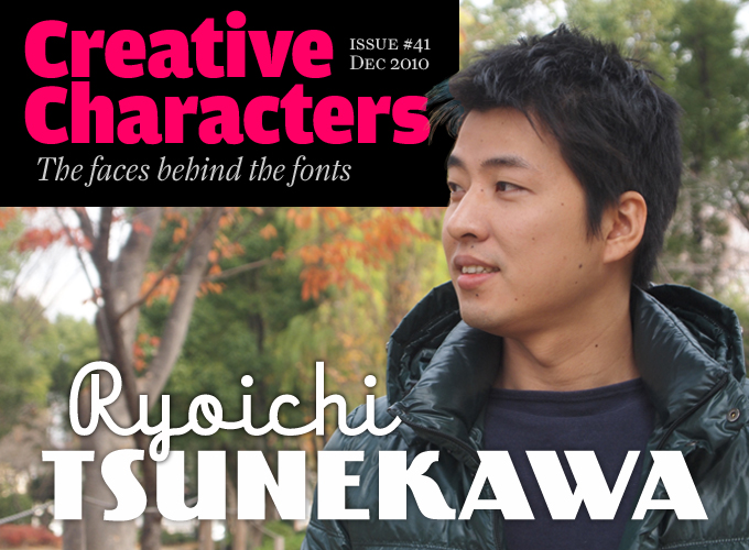
If the output of Japanese foundries represented on MyFonts is anything to go by, Nagoya must be the number one font city in Japan. Not only has Ray Larabie established his Typodermic foundry here; it is also home to Flat-It, one of our most prolific microfoundries specializing in lively retro and script fonts. Flat-It is run by Ryoichi Tsunekawa, who also created two specialist labels — Prop-A-Ganda and Holiday Type — to celebrate and market letterforms inspired by… well, propaganda and holidays. His taste is eclectic, his skills are remarkable, his production is huge. Meet Ryoichi Tsunekawa, architect of display fonts.
Ryoichi, you seem to have a broad range of interests: you were trained as an architect and engineer, and worked in that capacity for some time. How did you get from there to designing fonts?
Since my childhood, I have always had an interest in paintings, art and design, especially abstract forms such as geometric repeating patterns. When studying in college, I learned a lot about the development of design through the history of architecture. I didn’t study type design in class, but learned a lot about trends and the essence of these movements through architecture.
Architecture inspired me to learn more about typefaces. Architecture reflects the trend or mood of a particular time. For example De Stijl, Art Deco and Modernism have been cutting-edge design movements, and each was also reflected in architecture. At the same time, classical design styles are also found in architecture throughout history. In short, I think architecture is a kind of permanent design exhibition.
Typefaces are also very important in the presentation of architectural work. When preparing presentations of my architectural designs at university, I always worried about what font to use in order to make the presentation more appealing. I did not like using the same fonts as other people; I remember I used to stare at catalogues from foundries all over the world every day. Sometimes I would end up designing my own fonts. I guess that is how I started to create my own typefaces.
So how did you get to be a full-time type designer?
When I created fonts and distributed them free for fun in the beginning, many people started using them and I received good responses. I was very impressed that so many people around the world used my fonts — and I still am. So although I like architecture, I just can’t stop making fonts. Since my youth I have always focused on something intensely if its characteristics drew me in. If I worked as an architect and a type designer at the same time, I would have more to do than I could handle. So I chose to focus on font design.
Do you ever miss the team work that comes with working in an architectural office?
Although I am an independent designer now, and though working independently is probably most suitable for me, I am also attracted to team work. At times I’m a little envious of people who do work as part of a team.
Did you turn to Latin/Western type immediately, or did you design Japanese typefaces at first?
As a student and architect I was exposed to literature from around the world. The design movement that defines an era is worldwide, and reference books of architecture are basically written in the Latin alphabet. As a result, my doorway to type design was the Latin alphabet. The Japanese language has thousands of characters, so it takes a huge amount of time to make one font. I’ll save creating Japanese fonts for later in life.
camera
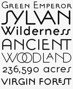
Camera is a rounded sans serif inspired by lettering in Art Deco advertisements. Its construction is based on simple, geometric shapes — straight lines and circles — resulting in clear yet charming letterforms. Camera comes with a choice of ligatures and small capitals as well as oldstyle figures to combine an early twentieth-century look with advanced typographic features.
nothing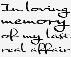
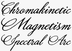
Nothing, a name that is likely to cause confusion in some studios (“What did you say you used to set that headline?”) is among Flat-It’s longtime bestsellers. It is different from many other script fonts in that it emulates spontaneous handwriting while maintaining a strong regularity. Its wide, connected shapes lend it an unmistakable authority. Check out the alternate f, h, t and more for that subtle hint of spontaneity.
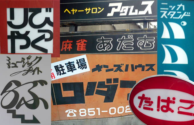
Street life: Japanese lettering styles that have inspired Tsunekawa
Your seem to have a very firm grasp on how Latin letterforms work. How did you learn it?
In Japan the Latin alphabet, which we call “Roma-ji” (meaning Roman letters), is used in addition to our native scripts: Hiragana, Katakana and Kanji. Many foreigners who visit Japan may be surprised to see that the Roma-ji alphabet is used on a lot of signage, posters and banners. (They may also be surprised that most Japanese aren’t fluent in English.) But the number of typefaces used has never been very large, so in the early days my exposure to Latin text was limited. Since I’ve only come across a few inspirational typefaces in Japan, I felt compelled to investigate further and research to try to create variations of typefaces.
So far, most of the fonts I have designed are decorative, so they are more suitable for advertising, posters and headlines. Only a few fonts in my collection are well-suited for body text, but I am always studying popular and classic fonts to create a broader and better range of fonts.
Designers of display type who live in Europe or the Americas have easy access to a lot of source material: markets and antiquarian shops are full of old magazines, packaging and advertising with vintage lettering. I suppose that’s not as obvious in Japan. Where do you find your inspiration and sources?
I only have a few guidebooks about making type, and some American and European magazines and books. The most inspirational thing for me is old Japanese signage and Roma-ji used on posters, movie titles and comics. They have a very eye-catchy and distinct design. Japanese letters are totally different from Latin letters, but they can be great inspiration for Latin fonts. Especially old ads have always impressed me, they inspire me to transcend time. As for particular styles, I very much like Art Deco. It is said to have been inspired by Japanese design and further developed in Europe. I also find inspiration and sources in the hand-lettering on decades-old shop signs from the pre-computer era.
You seem to have a special love of “vernacular” lettering — letters painted or drawn by non-specialists. Why?
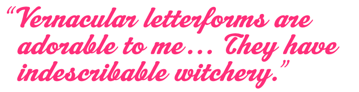
I love vernacular lettering because I think that the life of the people who lived in a certain period and in a certain region unfolds in the vernacular — and not only in lettering. Vernacular letterforms are adorable to me and their habit of using varying shapes of brush strokes injects spice into my design approach. They have indescribable witchery. I especially love lettering and ads from the early to middle twentieth century that are drawn or painted in such a freewheeling way.
Grandes Vacances
Grandes Vacances (“summer holiday” in French) was inspired by that crazy style of nineteenth-century poster typefaces know as Tuscan — most of us call it “Wild West”. It is combinable with two typefaces in a similar style: Mademoiselle and Homemade Text, but this one has what the others don’t: extra sets of top and bottom halves for a festive two-tone look.
xesy
If you shake its name, X-e-s-y makes no secret of its true nature. This sassy little font has the voluptuous curves and cheeky contrasts typical of Spencerian scripts but is less formal, more playful and very contemporary. Xesy has loads of ligatures and some nifty OpenType programming (requiring appropriate layout software) for that sophisticated hand-lettered look.
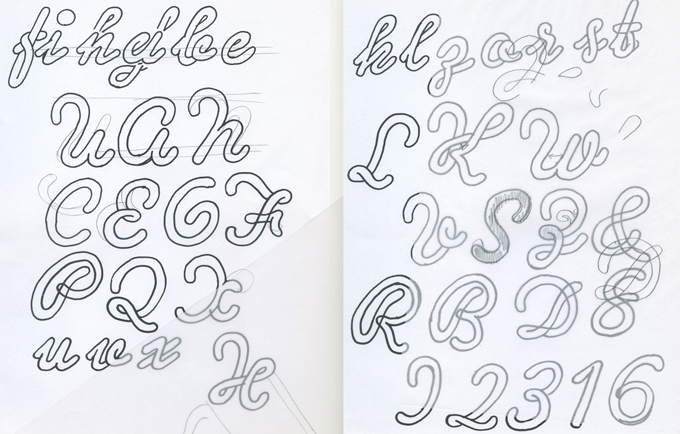
Development sketches for Sneaker Script
When working from a small sample, such as the name of the shop, you have to invent many new forms to complete the alphabet. How do you decide what forms to insert? Have you ever felt the need check with someone rooted in “Western” type culture if your solutions were “right”?
From signs, I get concepts, inspiration and a certain ambiance rather than specific letterforms. When making fonts on the computer, I research the letters that were used in the same period and region by referencing books and the internet. If you ask me if the solution is right, I can’t answer with an unambiguous “yes” in the academic sense; but I make “new” fonts, and I believe in my intuition.
Could you tell us something about the way you go about in designing a new typeface, and the tools you use?
I don’t have a particular tool. I am always looking for new ways. I first imagine the idea or concept. Sometimes I sketch the idea on paper but it is really just memos and scribbles. Next I draw the alphabet directly on the computer using FontLab Studio, or I scan the sketches to convert them into a font file. A lot of times in the middle of a project, I change my mind and start all over again from scratch, changing the design radically. After repeating this a number of times, I determine a certain direction. Then I work in front of the computer until I am satisfied. As a result it is often the case that the completed font is totally different from the original idea.
sneaker script
When this kind of script was popular back in the 1970s it had nicknames such as “toothpaste script” and “spaghetti type”. In digital design it’s not so easy to create that three-dimensional effect without losing the casual look of the hand-rendered models. With Sneaker Script, Ryoichi Tsunekawa has pulled it off convincingly, thanks to sophisticated OpenType technology which automatically selects the right connecting glyphs while you’re typing in OT-savvy layout software.
Among your peers in type design, whom do you admire?
I have not made an historical study of type design, so I don’t know much about historical or famous figures in this field. Among my contemporaries, I would like to name the P22 type foundry. I started buying their fonts about ten years ago — the first time I ever bought a font in my life. Mr. Ray Larabie, who is now also based in Nagoya, was the first font designer I met in person. There are only a few designers of Latin fonts in Japan, and I haven’t had the opportunity yet to meet them all. Recently my wife Yumiko, Ray and his wife Chikako enjoyed a Japanese winter dish, ‘Oden’ (hot pot). Next time it is my turn to take them to my favorite restaurant.
Flat-It is an unusual name. Where does it come from?
“Flat-it” means to make something two-dimensional. By that I mean that every abstract idea or image in my head becomes two-dimensional, in other words, it comes to life on paper as fonts.
Two years ago, you created a new label for retro-flavored fonts called Prop-A-Ganda. Why a separate foundry?
Sometimes, not only an idea for just a font, but a concept for series of fonts comes into my head. So I created a separate foundry to get organized and clarify my concept. Now I’ve created two new labels, Prop-A-Ganda and the Holiday Type series. The Prop-A-Ganda fonts are inspired by propaganda and commercial posters from the early twentieth century. On the other hand, Holiday Type is based on handwritten signs I found in Italy on holiday.
Your trip to Italy resulted in a spirited collection of Art Deco-flavored typefaces with evocative names like Osteria, Cartoleria, Farmacia and Motel. Was that trip actually planned as a kind of “font-hunting expedition”?
I visited Italy on my honeymoon and used this opportunity to find lettering. It would have been very expensive to visit Europe only to research them. For me as a Japanese person, it was an excellent opportunity to see and experience natural and practical Latin forms. In fact, it was more like a pizza-hunting expedition. We visited Rome, Naples and the surrounding islands seeking a supreme pizza. As it turned out, for both pizza and lettering, I had an enriching experience. I love hand-painted signs, which are rarer in Japan now, so when I found them in Italy, I was happy and felt nostalgic. I could not find any obvious differences between regions at the time; but perhaps the islands have more vernacular forms.
pag revolucion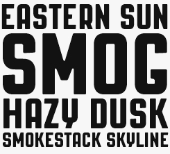
Revolucion is part of the Prop-A-Ganda series, inspired by twentieth-century propaganda and advertising posters. A sturdy, bold all-caps font, Revolucion is perfect for compact settings in black or multi-colored, on posters and book covers.
underconstructionism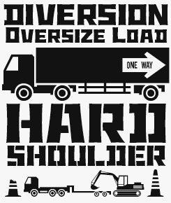
Anybody living in a big city knows it all too well: Underconstructionism is a permanent trend. This powerful package contains a black all-caps font and its stencil companion, as well as ridiculously low-priced set of signs for the road.
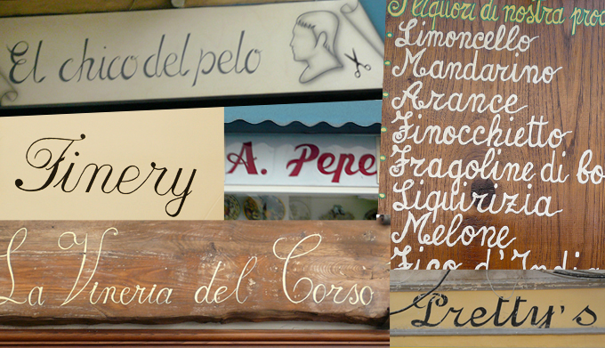
Vernacular lettering shot by Tsunekawa while traveling in Europe became source material for his Holiday Type series
What are the advantages and drawbacks of running your own company? Is being an independent designer difficult or unusual in Japan?
Well, the main advantage for me is that I can decide when to take time off. Although I do need extra time to explain to people when they ask me “what is your job?” because in Japan there are not many type designers, as I mentioned before.
Historically there used to be many craftsmen in Japan who were appreciated for their craft. Although for the past few decades working and making a career within a big company has been regarded as high status, I feel that craftsmen are starting to be appreciated again.
After joining MyFonts, you became almost immediately successful. Did you expect to actually be able to make a living by selling retail fonts?
Before joining MyFonts, I created free fonts and distributed them online for about three years. Throughout that time, I came to know that many people were always looking for new fonts. I didn’t know I would be able to make a living by it, but I strongly believed that a lot of people accepted my fonts and were pleased with them.
You’re quite productive. Would you describe yourself as a workaholic?
I don’t know if I’m workaholic or not, but I don’t care about working long hours and sometimes continue to work until late at night. Nowadays I pace myself to create good fonts. In spring 2011, I’m going to release new and creative fonts. Stay tuned!
We can’t wait! Happy New Year!
lily wang
Lily Wang is one of Ryoichi Tsunekawa’s most successful script fonts. It strikes an interesting balance between a traditional script with all its curls and flourishes, and roughened, nonchalant detailing. Lily Wang is part of Flat-It’s series of luscious yet slightly time-worn script fonts, to which Pansy Bo and Daisy Lau also belong. All are based on ladies’ handwriting from nineteenth-century Hong Kong.
pag trust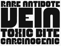
A nice big fat 1970s-style to end, as the French say, in beauty. PAG Trust is part of the Prop-A-Ganda series.
Available now:
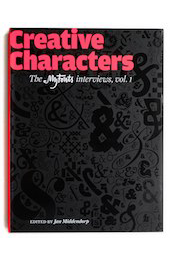
Creative Characters, the book
Creative Characters is the MyFonts newsletter dedicated to people behind the fonts. Each month since July 2007, we have interviewed a notable personality from the type world.
The first two years of these interviews have now been collected in a beautifully produced book. Twenty-six interviews, expanded with case histories, behind-the-scenes imagery and superb examples of fonts in use.
Interviewees include David Berlow, Jim Parkinson, Cyrus Highsmith, Ray Larabie, Nick Shinn, Rian Hughes, Alejandro Paul, Dino dos Santos, Veronika Burian, Ronna Penner, Gert Wiescher, Hubert Jocham, P22, Underware and Jos Buivenga.
Order the book now at Amazon.com, or at a good bookshop near you.

Who would you interview?
Creative Characters is the MyFonts newsletter dedicated to people behind the fonts. Each month, we interview a notable personality from the type world. And we would like you, the reader, to have your say.
Which creative character would you interview if you had the chance? And what would you ask them? Let us know, and your choice may end up in a future edition of this newsletter! Just send an email with your ideas to [email protected].
For a complete overview of past Creative Characters newsletters, have a look at the archive.
Colophon
This newsletter was edited by Jan Middendorp and designed using Nick Sherman’s original template, with specimens by Anthony Noel.
The Creative Characters nameplate is set in Amplitude and Farnham; the intro image features HT Cartoleria and PAG Etiketa; the pull-quotes are set in Machiarge; and the large question mark is in Farnham.
Comments?
We’d love to hear from you! Please send any questions or comments about this newsletter to [email protected]
Subscription info
Want to get future issues of Creative Characters sent to your inbox? Subscribe at www.myfonts.com/MailingList
Newsletter archives
Know someone who would be interested in this? Want to see past issues? All MyFonts newsletters (including this one) are available to view online here.