
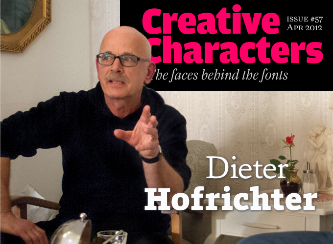
Photo by Florian Hardwig
Just over a year ago, a brand new foundry appeared on MyFonts — Hoftype. In twelve months the foundry published an astounding array of useful, elegant and original text typefaces. The man behind Hoftype is Dieter Hofrichter, type designer in Oberschleißheim, near Munich in southern Germany. Hofrichter’s career as a professional type designer began in 1989 when he was hired by H. Berthold AG. In the company’s famous studio he worked with the late Günter Gerhard Lange, the most exacting taskmaster in post-war German typography. This issue of Creative Characters was co-edited with Berlin-based type designer Dan Reynolds, who asked most of the questions and transcribed the answers. Many thanks!
An extended German-language version of this interview is available on our German sister site, MyFonts.de.
You trained as a graphic designer, but later became a full-time type designer. That was not an obvious step at the time — type design being such a specific skill. How did one thing lead to another?
I began studying at a private design school in Mannheim when I was very young. Writing and lettering were part of the graphic design program. We wrote with the broad-nibbed pen and designed lettering for posters. All of this was very decorative and had nothing to do with text typography. I even had classes with the famous Herbert Post, who lectured there as a favor to the school’s director. But as the students lacked any typographic background or orientation, we weren’t very interesting material for Mr. Post. I suppose he wasn’t impressed by our level.
I went on to study graphic design at Nürnberg Art Academy. Typesetting and typography were taught there as well, but not very intensively. After graduation I worked at the Historical Museum in Frankfurt, where I designed exhibitions. I lived with friends in a theater workshop, and had a lot of free time on my hands. And out of the blue I decided to try to design a typeface. My first uppercase alphabet looked kind of nice — no more, no less. But I continued and created my first text typeface. I wasn’t happy with it, but I couldn’t put my finger on what was wrong with it. I didn’t have any criteria yet as to what a text face should look like. A text face is totally different from the scripts we wrote in art school: blackletters and uncials, artsy-fartsy serif faces that had nothing to do with the history of printing.
And so, in the early 1980s, I began an independent study of about five years. I looked into printing types in detail. How were they made? A Garamond, for example: Why are the italics so completely different from the uprights? I created several typefaces in a rather curious way. I painted alphabets on large boards. At first I drew them really big, but I quickly realized how impractical that was. So I switched to a letter size of about 8.5 cm (just over 3"). I had a very good 6×6 camera that I used to reproduce those letters, which I then cut out with scissors. On photo paper, I reduced the characters to about an inch in height. From that I made something that looked like the old Letraset sheets — I even used the same letter frequency: many ‘e’s and ‘n’s, but fewer ‘a’s, and so forth. I drew a baseline on each character for building lines of text. The reproduced lines were then composed into longer lines and blocks of dummy text to give me a good impression of the final font.
When I was finally happy with my first type designs, I put them into a portfolio and sent them to the H. Berthold AG typefoundry.
And it worked out? Just like that?
It did! Günter Gerhard Lange — the artistic director of H. Berthold AG — wrote back to me personally. To my surprise, they’d selected a typeface which I regarded as a kind of youthful folly, even then. I had put it into the portfolio merely as a filler. So although I thought there were much better designs in there, that was the one they wanted. It was released as part of the Berthold program under the name of Vergil. Anyway, I had a foot in the door, which was the main thing.
Some time later I officially applied for a vacant position at Berthold, and that worked out well, too.
What was it like to work with Günter Gerhard Lange?
My first job at H. Berthold AG went like this: Günter Gerhard Lange came in and showed me an oldstyle family he had designed in the 1950s. This was Arena, a typeface for hand-setting. Originally there was a Regular weight and a Bold, perhaps also a Heavy version. But these cuts were all very different in shape: the Regular was rather broad and round — a very classic typeface — and the bolder weights were really narrow. They did not fit together terribly well.
Since Arena was relatively successful, Berthold AG had the idea to do a complete revamp. The plan was to develop a family in which all members were perfectly balanced — from Light to Bold. I drew them, Lange looked at them and made corrections. This went back and forth a few times. I did not have to remain strictly faithful to the original model. The font family was then published as Neue Arena, or Arena New. It had actually become a very different typeface from the original Arena. This approach became our working method.
For some reason, Lange held me in high regard. At the beginning he said he wanted only three characters when starting on a new font — ‘n’, ‘a’ and ‘g’. But I preferred showing him half an alphabet, which he was not accustomed to. I would also present alternative shapes for each character. I think he liked the fact that he simply had to choose. In this respect, Lange’s career has been remarkable: his early typefaces were his own designs — in the 1950s he made several fonts in the style of the times, mostly calligraphic in character. At some point he stopped doing original designs and went on to produce only new editions of classic faces, or to revise — and usually improve — designs by others. In fact, Lange was not very interested in new designs. He simply wanted the fonts that were released to be very well made — in particular the “classics”. That was his main ambition: any fonts that were submitted were improved under his scrutiny.
Sina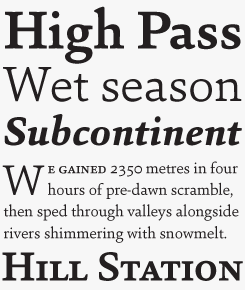
Sina is a self-confident text face with sturdy serifs. Distinct, classically proportioned ascenders and descenders ensure pleasant reading. Robust yet warm, it references the virtues of early classical printing types but presents a unmistakably contemporary look. It is great for headlines, but with its even text flow it works very well for long texts. Sina comes in a fine-tuned range of six weights with matching italics, equipped with small caps, multiple figure styles and more.
Cassia
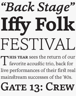
Of the many typefaces Hoftype launched during its first year, Cassia was the biggest success: it became one of MyFonts’ most popular fonts of 2011. A dynamic modern-face, somewhere between a humanized slab serif and an updated Clarendon, it is more individual and agile than most slab serifs. Superbly readable, Cassia comes with small caps for all weights, a wealth of ligatures and multiple figure styles.
Cala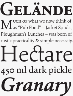
Cala is an interpretation of late 15th-century Venetian types, such as those used by Aldus Manutius, but with a contemporary look. Cala has an energetic profile, achieved through soft outlines and a flowing rhythm. It is lively, remains stable in small sizes and reveals beautiful detailing in display sizes. Cala comes in eight styles, each containing standard and discretionary ligatures, small caps, and a broad range of figure styles with matching currency symbols.
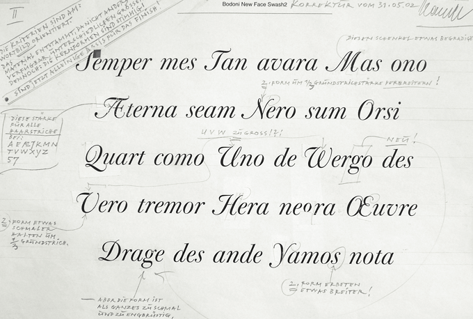
Part of a proof corrected by Günter Gerhard Lange
Did you discuss the works-in-progress in person? Or did the drafts go back and forth through the mail?
By mail, most of the time, since Lange did not work in-house anymore, and only came by once a week. He never said much, but he went into detail in the corrections he made at his home studio. Character sets were printed on photographic paper and sent to him on A4 sheets, with the type printed in the center. Lange sent back the corrected sheets, which always looked terrific because he had such a clear handwriting. Around the text setting the whole page was filled with notes, with lots of arrows, pointers, and extra sheets attached — he was extremely detailed. I learned a lot from this — not so much about taste or style, but about functionality. That was his main concern — all the rest was vanity to him.
Lange wanted to receive the typefaces as photographic prints at 18pt type size — the entire character set. But those 18pt prints only served to make corrections in writing. The final evaluation was made on the basis of a reduction at 8pt. To him, that was the absolute criterion for a text font. He held the prints against the light, and sometimes studied them with a magnifying glass. “8pt is the moment of truth” — that was his motto. It makes sense, because at that size you can judge the proportions, see whether the character width is sufficient for a text font, etc.
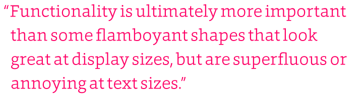
Functionality is ultimately more important than some flamboyant shapes that look great at display sizes, but are superfluous or annoying at text sizes. Lange was really strict on that point. So on the one hand he gave me a lot of freedom, and on the other, he was relentless when it came to functionality.
How were fonts produced at the time? Was the process digital, or still analog?
When I worked in-house at Berthold’s type design studio between 1989-1993, the fonts were all digital. But in the design phase they still used technologies originally developed for photo-typesetting. My task was limited to making drawings and basic character spacing. I actually worked on paper or cardboard, with ink and opaque white. For each character, a working drawing was made at 12 cm [4.7"] cap height. I then handed in my drawings for digitization. I had nothing to do with the technical side of font production. Lange said to me: “You just make your drawings, don’t worry about the people over there.” My colleagues sat in front of their Tektronix monitors — which only displayed a dim outline — using Ikarus font development software. It was a very cumbersome affair in the beginning. Ikarus allowed you to create and edit outlines, but without a mouse. All input was done on the keyboard, you had to know every shortcut to edit the outline. In order to test the design, you made a reproduction of the drawing and reduced it to reading size in the darkroom. After that it was back to your ink and opaque white.
At some point this process became too tedious for me; I thought I would go crazy! So I simply began doing it myself, and learned to use Ikarus. Things went a lot faster. I made photographic prints of my own designs, or cut them with a plotter from Ulano film and made further reductions. Thank God I had the courage to take that step — it gave me a very good foundation to learn Ikarus M (the Mac version written by Petr van Blokland) and work on them at home later. From 1993 onward, I worked independently.
Foro
Foro combines the pleasant proportions of Hoftype’s humanist serifs, such as Cassia and Cala, with the principles of a slab serif or Egyptian: a low contrast between thin and thick strokes, and sturdy, rectangular serifs. The result is a slab serif with an appealing flow, and less harsh than many slab serifs. It is excellent for complex text settings — catalogs, listings, annual reports — and works well on the web, while its crisp and distinct details are an advantage in display sizes.
Sonus
Sonus is a near-monoline sans: it has almost no modulation between thick and thinner strokes. Influenced by early English sans serifs — Gill Sans comes to mind — it is powerful and dynamic but with some classical features. Its firm structure makes it a fine choice for text, while its lively linearity comes to the fore in display sizes.
Did you continue your collaboration with Günter Gerhard Lange after your time at H. Berthold AG?
Yes, we began several new fonts, some of which were never quite completed. The idea was to develop designs to a basic level which would be finalized later. I only have prints of some of these fonts. After the Berthold library was taken over by Berthold Types Ltd. in Chicago, the first family we produced was Whittingham, an English typeface from the mid-19th century. Charles Whittingham was a printer; he probably did not produce this font himself, but bought it from William Thorowgood. I think it has an important place in the Berthold library — it is the Protestant counterpart of the Catholic Bodoni. It is a very austere typeface. You sense the improvement of production tools of the period — those sharp and fine outlines, engraved in steel.
In early 2011 you presented your first Hoftype fonts. To launch one’s own digital foundry and start selling fonts via MyFonts is a common move among young designers, but less so among people of your generation. What motivated you to start up Hoftype?
I’ve begun so many typefaces over the years. I accumulated a lot of ideas and worked on many of them, without ever completing any of it. I simply didn’t find the time. Also, I lacked a technical background in font production. So I started learning these things two-and-a-half years ago. I acquainted myself with kerning, OpenType and all those things. Then I got going.
After its debut on MyFonts, Hoftype was almost immediately successful. Were you in any way overcome by the sudden popularity of your fonts, or surprised that it worked out so well?
Not at all, it was what I expected, haha! I was even a bit disappointed at the start. Impara was the first one, and for months nobody bought it. The next few sold quite slowly as well. But I gradually realized that you have to establish a brand; people aren’t very interested in a single family from a new foundry. But after the first bit of success, the earlier fonts, too, started picking up. The whole marketing thing is very new to me. You have to experiment a little, see how others do it: they give away one or two fonts for free and still realize good sales, so you try something similar. I don’t think I’m losing much when thousands download the one free font in the family. For customers who are seriously interested it’s an advantage because they can try out a complete font, including the OpenType features. In any case, I’m happy with the result: about eighty percent of my sales are now complete families.
Have the new Hoftype fonts all been designed recently, or do you have a stack of old concepts that you gradually prepare for publication?
I don’t have a particular system. Several of my fonts are revisions of typefaces that are in fact quite old. Cassia, for instance, was started fifteen years ago but I did not publish it until 2011. It originally looked quite different: it began as a neoclassical text face with relatively fine hairlines and thin serifs. Then I realized it wasn’t very original, there are already a lot of those faces around. I wanted something that looked contemporary — powerful, sturdy and more linear. So I simply reinforced the hairlines and serifs; that was the most important change. I find it more original now.
Each of my typefaces has its own history. The most recent one is Foro. It was produced in a relatively short time. Someone proclaimed 2012 to be the Year of Slab Serifs on MyFonts, so I figured it was time I do one of those! I must admit Foro was finished in just a few weeks. It has 16 fonts altogether: eight weights with italics.
Corda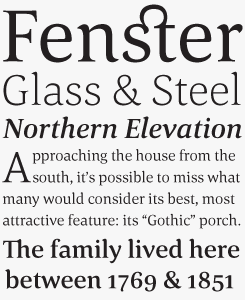
With Corda, Hofrichter decided to go for a more decorative face than usual. The result was an elegant serif family with an easygoing flow. It is semi-contrasted and even in the heavier styles appears light and breezy. While a pleasant font for reading longer texts, it is very elegant and attractive and in display sizes.
Impara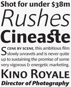
Designed in 2010, Impara was the very first Hoftype family published on MyFonts. With its distinct humanistic characteristics, soft contrast between thin and thick strokes, and somewhat squarish silhouette, it represents a synthesis of linear coolness and classic elegance. As a text font it is a great solution for stylish business communication, magazines or branding. In display sizes, it reveals elaborate details. Impara comes in 10 well-equipped styles in OpenType and TrueType format. Each font contains small caps, lining and old style figures with both tabular and proportional spacing, matching currency symbols, and ample language coverage.
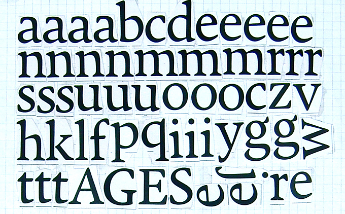
Paste-up of photographically reduced drawings of one of Hofrichter’s early faces
Many designers need a lot more time to produce a new font family. How do you manage to be so productive?
I can handle the tools relatively quickly, because I’ve been doing this kind of work for many years. It’s true that I haven’t made finished fonts for a long time, but the process — producing and interpolating the characters, controlling and correcting — I can do all these things quite efficiently. Before I sit down, I have formed quite a precise idea in my head of the shape I want to see. And with digital tools you get a result so much faster! I haven’t drawn fonts by hand for a long time. Sometimes I do regret that a bit.
Your typefaces, whether with or without serifs, are all proper text fonts. Is type for body text your definitive niche, or can we expect display and script fonts from Hoftype in due course?
Of course you can make a broad array of fonts, in every direction. But that’s not my thing. I do text fonts. I like looking at other kinds of faces, but since I work alone, I must somehow limit myself. This work is enough for me. It is not so easy to make good text fonts, and it is a problem I like to delve into. I once thought “OK, I need to go and make something more popular,” and then did Corda. It has sharp serifs, and pointed, drop-like forms — so it is rather decorative. Corda is selling well, but rarely as a family. It is usually bought in individual weights, indicating that it is mostly used as a display font.
In the field of text fonts, I’m not particularly interested in pure replicas. There have been many revivals based on, say, a printed page by Manutius or Jenson, and people have discussed whether this or that version is most faithful to the original. All this is speculation, because you cannot know how the forms were actually meant to be. Even if I could reconstruct the original lead type… but the type is worn and the outlines on the page are deformed. Did the punchcutter take the modifications into account that are produced during multiple print runs on rough paper, or is it a random result? Those are pointless questions.
When I make typefaces that relate to historical forms — such as Cala or Sina — it is not my intention to make revivals. I just want to use what worked well in the old types, and apply that to today’s sense of form.
All your fonts on MyFonts are also available as web fonts. Your designs are very contemporary, and web fonts are the most recent important development in type. Does the issue of on-screen representation play a role in your design decisions?
I have received some good feedback on my web fonts, but I think that’s mainly because my fonts look relatively stable. As I’ve said, I always have in mind that a font should look good at 8pt. So, yes, a sturdy text font is likely to be a good web font. On the whole, my fonts seem to be well suited for the web. Apparently, it’s almost automatic — a happy by-product that I had not counted on. Of course, I don’t mind at all!
Thank you for sharing these fascinating stories with us!
Erato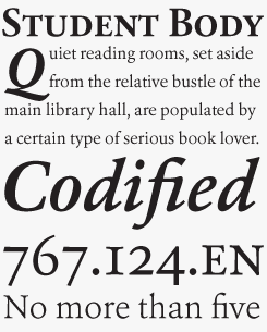
Erato follows the structure of French and Dutch types from the 17th century — think Van Dijck or Kis. But instead of being historical, it is utterly modern in its detailing. The simplification of formal similar elements throughout the alphabets creates a homogeneous and contemporary impression.
Erato comes in six well-equipped weights and in OpenType format.
epoca pro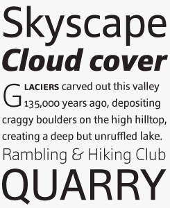
Epoca is a classic linear sans for text and display. With its economical proportions, neutral appearance and discreet elegance, it is a strong and inconspicuous workhorse. The slightly angular shape of the round elements results in a quiet flow of the line which enables fatigue-proof reading even with large amounts of text.
MyFonts is on Twitter and Facebook!
Join the MyFonts community on Twitter and Facebook. Tips, news, interesting links, personal favorites and more from MyFonts’ staff.


Who would you interview?
Creative Characters is the MyFonts newsletter dedicated to people behind the fonts. Each month, we interview a notable personality from the type world. And we would like you, the reader, to have your say.
Which creative character would you interview if you had the chance? And what would you ask them? Let us know, and your choice may end up in a future edition of this newsletter! Just send an email with your ideas to [email protected].
In the past, we’ve interviewed the likes of Gerard Unger, Melle Diete, Jonathan Barnbrook, Chank Diesel, Veronika Burian, José Scaglione, Underware and Christian Schwartz. If you’re curious to know which other type designers we’ve already interviewed as part of past Creative Characters newsletters, have a look at the archive.
Colophon
Dieter Hofrichter was interviewed by Dan Reynolds with Florian Hardwig and Jan Middendorp, with final editing by the latter. Designed using Nick Sherman’s original template. Specimens by Anthony Noel.
The Creative Characters nameplate is set in Amplitude and Farnham; the intro image features Foro Black and Sina; the pull-quote is set in Foro Light; and the large question mark is in Farnham.
Comments?
We’d love to hear from you! Please send any questions or comments about this newsletter to [email protected]
Subscription info
Want to get future issues of Creative Characters sent to your inbox? Subscribe at www.myfonts.com/MailingList
Newsletter archives
Know someone who would be interested in this? Want to see past issues? All MyFonts newsletters (including this one) are available to view online here.