Skip to content
Home / Fonts / Wordshape / Pompeian Cursive
Pompeian Cursive

Pompeian Cursive

by Wordshape
Individual Styles from $30.00 USD
Pompeian Cursive Font Family was designed by Oswald Bruce Cooper, Ian Lynam and published by Wordshape. Pompeian Cursive contains 2 styles.

More about this family
FREE 30-DAY TRIAL of Monotype Fonts to get over 150,000 fonts from more than 1,400 type foundries. Start free trial
Start free trial

About Pompeian Cursive Font Family


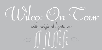
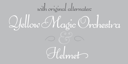
Pompeian Cursive is a calligraphically-inspired display typeface featuring a limited number of alternate characters and a handful of graceful ligatures. A lively set of non-lining numerals accompanies, as well as a few calligraphically-inspired flourishes for ornament. The history of this typeface: Oswald Cooper’s relationship with the Barnhart Brothers & Spindler foundry was one instigated under the auspices of creating new styles of type in lieu of following stylistic trends. In 1927, BB&S requested that Cooper create a script-like cursive typeface design in step with Lucien Bernhard’s Schoenschrift and ATF’s similarly-styled Liberty typeface. In response to BB&S’s desire to emulate instead of innovate, Cooper wrote to Mcarthur, “I am desolated to see Barnhart’s hoist the black flag. Your own efforts through the years to boost the foundry into a place in the sun as an originator seem wasted.” Still, Cooper took up the task at hand, creating a delicate, sophisticated type design which he named Pompeian Cursive. The typeface featured a limited number of alternate characters and a handful of graceful ligatures. A lively set of non-lining numerals accompanied, as well as a few calligraphically-inspired flourishes for ornamenting the end of lines of type accompanied the typeface, as well. By reviewing the few remaining original drawings for the type, as well as copious samples of Pompeian Cursive from both Cooper & BB&S' proofing process and period-specific type specimens, Wordshape presents the first digital version of this classic hybrid script/sans typeface, complete with all original alternate characters and ornaments. Pompeian Cursive has been intensively spaced and kerned for the finest setting for weddings, announcements, and general display work. - What was the inspiration for designing the font? While researching a biographic essay for Japan’s IDEA Magazine, I came across the original proofs and drawings for Pompeian Cursive. While a number of foundries have released interpretations of Cooper’s assorted typefaces, they stray from the original rather dramatically in parts. Cooper is without a doubt my favorite type and lettering designer, and to bring a refined return to his original intentions is an immense gift. - What are its main characteristics and features? Pompeian Cursive is a typeface which functions as both a display face and a limited text face. It features classy, thoughtful, and delicate swash capitals and rugged lowercase characters with a low x-height and gracefully long ascenders and descenders. - Usage recommendations: Display type or text-setting. Perfect for newspaper work, editorial design, materials intended to invoke an "old-timey" flavor, or just about anything in need of personality.

Designers: Oswald Bruce Cooper, Ian Lynam

Publisher: Wordshape

Foundry: Wordshape

Original Foundry: Barnhart Brothers & Spindler

Design Owner: Wordshape

MyFonts debut: Apr 29, 2010

Pompeian Cursive

About Wordshape

Wordshape is a boutique type foundry and publisher operating in Tokyo. In addition to our library of retail fonts, we also design custom fonts for clients of all sizes. From the modification of existing fonts to the design of a complete family from scratch, we design typefaces to fit most needs. Select clients include Adidas, Bandcamp, Google, Hofstra University, Mozilla, MTV, NASA, Nike, Onitsuka Tiger, Pivotal, Plaid, and Tokyo University.

Read more

Read less