Headlines and Sub Headings Manual.

Headlines and sub headings present two sets of issues: structural and typographic. Addressing the structural issue makes dealing with the typography much easier.
The structural issue is that headlines and sub headings are signposts for the reader. Headlines are about capturing the reader’s attention. Sub headings build structure and define hierarchy.
Even though headlines are normally designed for impact, they should also be easy to read. The best headlines use just a few words. Headlines that have many words, or that take up more than three lines, do not have the appeal and power of those that are short and punchy.

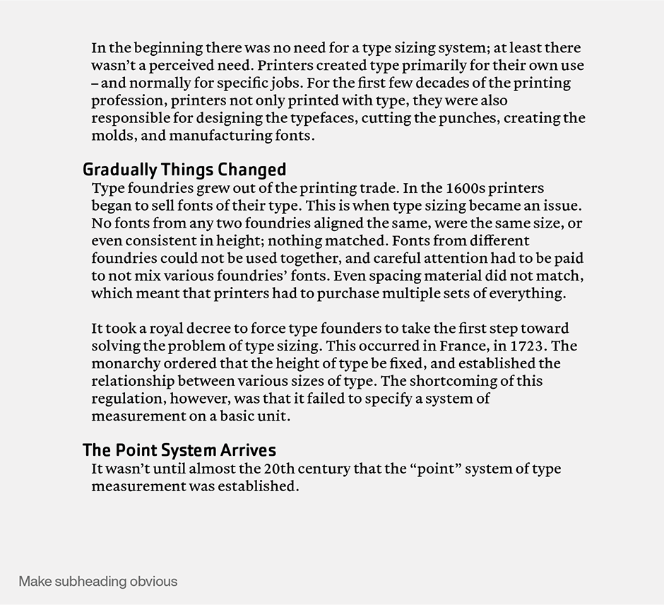
Sub headings orient readers. The best create clear hierarchy, and are more than just placeholders or labels. Readers should be able to scan sub headings and get an overview of a document. Sub heads also visually break up lengthy text copy and provide introductions to new concepts or major changes in content.
Sub headings should stand out from the rest of the text copy. Change typestyle, change size, set them in a different color, run them into the left gutter, take your pick, but differentiate sub headings from headlines. If you don’t, they become noise rather than road signs.

One display typeface for headlines, sub heads and other large copy is often enough. Size and color are the tools to use to create levels of importance. If you want to use more than one typeface for display use, it’s best to choose both designs from the same family – a bold and bold condensed design, for instance.
There should be an obvious contrast between headlines and text copy. Text in an elegant serif design like ITC Galliard® can be contrasted with a strong, industrial strength sans serif like Cachet™. If text is in a utilitarian typeface like Perrywood™ or Monotype® Modern, a display design like Carter Sans™ will provide a significant counterpoint.
Once structural issues are addressed, dealing with the typography is pretty straightforward. Following a few guidelines makes things even easier:
- Headlines should be obvious to capture reader’s attention
- Headlines should rarely be set all caps because cap and lowercase headlines are easier to read. All cap headlines also occupy more space, and can slow down the reading process.
- Decorative and theme based headline typefaces can augment the content or message of the text

- Headline and sub headings typefaces should contrast with the typeface used for text copy.
- Don’t hyphenate within a headline.
- Sub headings generally should not be set in a decorative typeface.
- Bold typefaces are better than italics for headlines and sub headings.
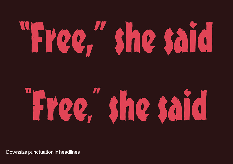
- Punctuation in headlines almost always looks too large. Reduce it to make things look right.

- To avoid confusion with headlines, sub headings should be preceded and followed by at least three lines of text.
- Do not underline sub headings. In fact, don’t underline anything.
- Strong typographic contrasts typically don’t create problems but, when typefaces from different families that look a lot alike are combined, the result can be visual discordance rather than emphasis
Download a pdf version of the Headline and Sub Headings manual.


