Discover legacy content from FontShop.com, preserved for your reference.
A foolproof way to distinguish if what you are doing is kerning or tracking is to simply look at the I-beam. If it is blinking between two characters while you are adding or subtracting space, you are kerning a letter pair. If however text is selected i.e. highlighted – even if it is only two characters – you are tracking a sequence of characters. There is also a distinction in intent: while kerning is specifically applied to solve a problem, tracking is most often used as an aesthetic device.
Keeping Track of Tracking
 is displayed in the lightest yellow, with the space inserted by the tracking marked in a darker shade. To track one single word, you have to omit the last letter from the selection or the word space after that word will be larger than the space preceding it.](https://lg-assets.myfonts.com/fs/uploads/content_image/attachment/385117/mini_magick20160524-27106-rn92rf.png)
So, what does tracking exactly do? We often describe it as adding space or subtracting between glyphs in a sequence of characters, but that is not entirely accurate. Positive tracking adds an identical amount of space, expressed in the same units as kerning, after every character in a selection of text (negative tracking removes space after every character). This includes punctuation and spaces. It may sound counter-intuitive, but if for example you want to track a single word in a sentence, your selection cannot include the last letter of that word. If the next-to-last character is the final character included in the selection, extra space is added after that character, so de facto in between the two last characters. If however the last character is the final character in the selection, extra space is added between the last character and the space character, thus increasing the amount of space after the word. This will cause the space after the word to be wider than the space before the word.
Tracking For Size
 optimised [FF Clifford™](/familes/ff-clifford)’s design for sizes (from top to bottm) 18 pt, 9 pt, and 6 pt. Besides the differences in design, the type also runs wider as it is drawn for increasingly smaller sizes.](https://lg-assets.myfonts.com/fs/uploads/content_image/attachment/385116/mini_magick20160524-27106-tsrhdh.png)
Tracking is often applied as an aesthetic device, for example to lend extra gravitas to a book title in capitals on the title page, or to give a headline a little room to breathe (or on the contrary to make it look more solid). However it can also be used to correct the general spacing of a typeface. Originally in metal type, size-specific variations were cut for each point size to optimize the legibility of a typeface. Type cut for smaller sizes typically had more generous proportions and sturdier features, while the same typeface cut for display sizes often was narrower, with longer ascenders and descenders, and a higher contrast. These differences were quite spectacular in the types cut by Bodoni and his contemporaries.
For economical reasons one single optical size was used as the basis for new versions when metal typefaces first transitioned to photo composition and later to digital. Usually this was an intermediary size that still would work reasonably well when scaled up or down. Because spacing is an integral part of the type design process, these versions for new technologies often seemed too tight when used in small body sizes, or too loose in large display sizes. While users have no control over the actual design of the glyphs, they can correct the spacing by tracking the typeface. Subtle positive tracking of small text adds space between the characters, increasing the legibility; thoughtful negative tracking of headlines and titles moves the glyphs closer together which improves the letter fit.
Tracking Around
 by [Gareth Hague](/designers/gareth-hague)](https://lg-assets.myfonts.com/fs/uploads/content_image/attachment/385118/mini_magick20160524-27106-l51mp3.png)
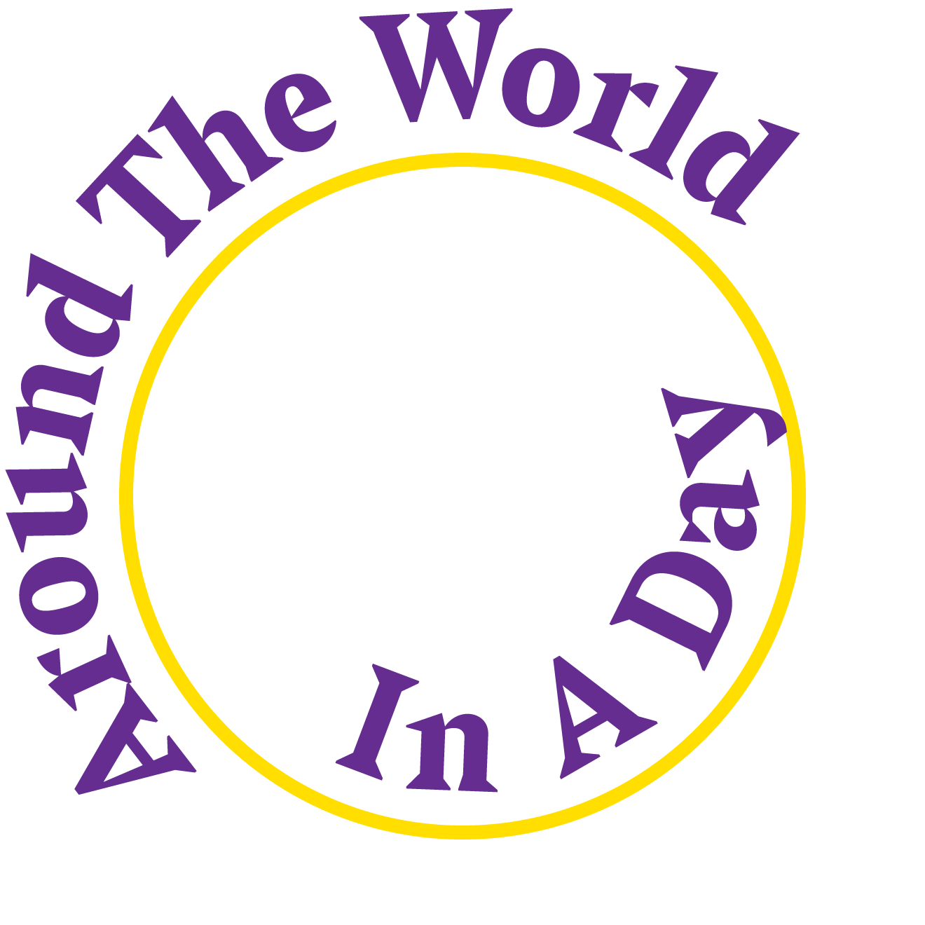
As we have seen in our mid-series intermezzo Adventures in Space: Special Cases, setting type on a curve or circle can affect the spacing and kerning quite dramatically. When you compare text outside a circle with the exact same text set on the inside of that exact same circle, the former is set looser than the latter. This makes sense: the tops of the letters will fan out when set convex, but crowd each other when set concave. The effect is exacerbated if the baseline is shifted to detach the type from the circle. The further text outside a circle is removed from that circle, the looser it becomes, while moving text inside a circle towards the center makes it increasingly tighter. This is an instance where tracking provides a simple and quick solution to restore the original spacing of the typeface. But do keep in mind that you still need to double-check and correct the kerning in any problematic spaces you may have created.
Beyond Tracking
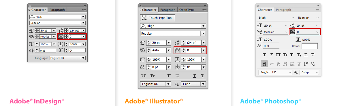
While tracking is a perfectly acceptable solution, experienced typographers may want to be able to change the global letter spacing and word spacing independently. The Adobe® Creative Cloud® apps allow users to fine-tune these parameters in the Justification dialogue window. While the Minimum and Maximum values for Word Spacing and Letter Spacing define a range of acceptable spacing for justified paragraphs only, the Desired value also does so for unjustified paragraphs. By changing the Desired values you can fine-tune the letter spacing and word spacing independently for entire paragraphs.
Do Not Track!
I am stealing this rallying call from online privacy activists to draw your attention on instances where you really really should avoid tracking.
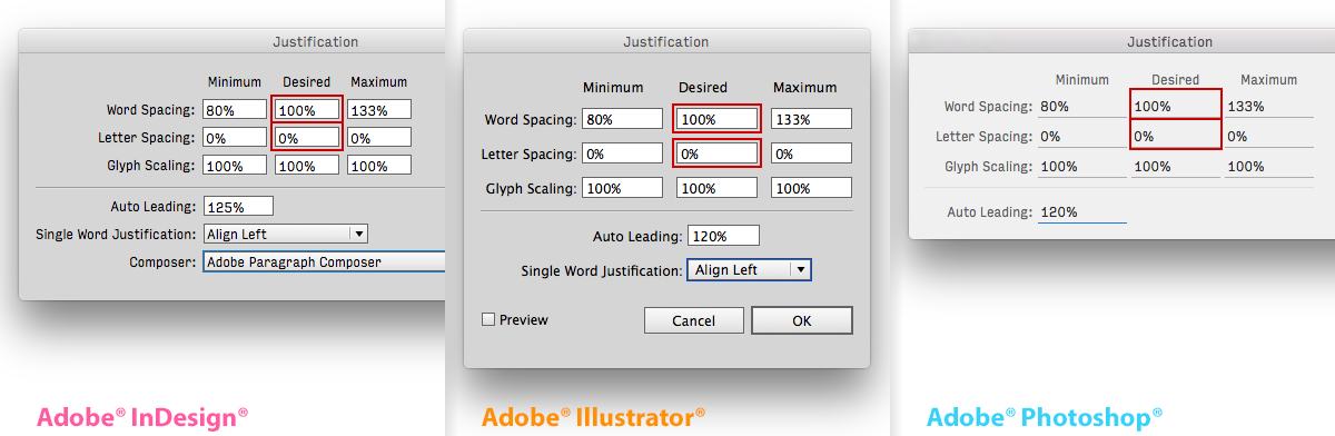
The first one is excessively tracking lowercase. Ironically my first example explaining tracking is something I would highly discourage. As we learned in Adventures in Space: Spacing reading relies on the interplay by the spaces within the letters and the spaces between the letters. Therefore the legibility of mixed-case or lowercase text can be severely hampered if the shape and proportions of the puzzle pieces of white between the letters get distorted by tracking. Due to the architectural structure of the letter forms this is somewhat less of a problem with capitals.
](https://lg-assets.myfonts.com/fs/uploads/content_image/attachment/385123/mini_magick20160524-27106-w870jo.png)
However one of the most egregious blunders is tracking connected scripts. After a type designer went through all the trouble of painstakingly optimising every single letter connection and often creating scores of contextual alternates to have the typographic flow look flawless, all that work is ruined when space is added or subtracted between the letters. Even the slightest tracking can be disastrous. Frank Grießhammer dedicated a satirical Tumblr to this typographic faux-pas.
Confusing Shortcuts for Tracking and Kerning
The keyboard shortcuts associated with tracking (and kerning) in Adobe CC apps are identical to the shortcut for selecting text one word at a time in essentially all other apps you use. If you’re used to selecting text with the keyboard, it’s easy to accidentally apply kerning or tracking values to your text, so do it carefully.
Previous episodes
- Part 1 – Adventures in Space: Spacing
- Part 2 – Adventures in Space: Kerning
- Part 2.5 – Adventures in Space: Special Cases
Header image by Izabela Keppler. FF Outlander® typeface by Rian Hughes.