Discover legacy content from FontShop.com, preserved for your reference.
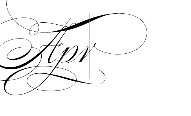
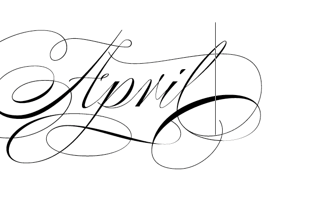
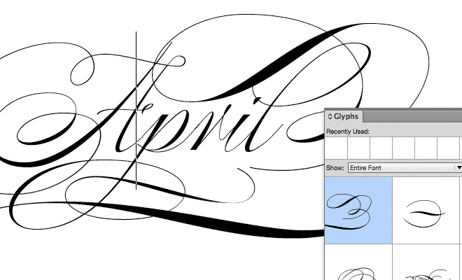
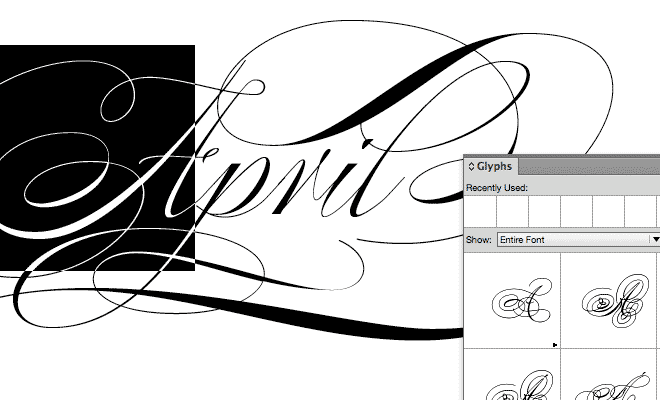
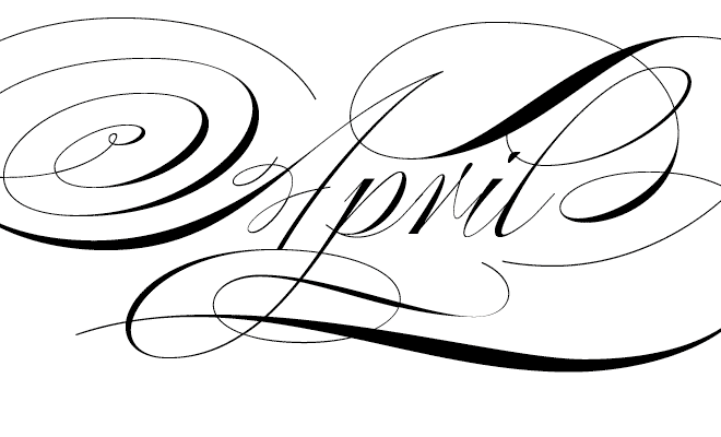
Unlike discretionary ligatures, whose use is left solely to the typographer’s discretion (meaning your discretion), a contextual alternate is a glyph designed to work in the context of other adjacent glyphs. In connected scripts, contextual alternates are particularly important in order for the strokes to connect properly from one character to the next while maintaining a believable, natural flow. Full-featured script fonts that make use of contextual alternates, like Alejandro Paul’s Poem Script, shown here, generally include several alternates for each glyph, so even after the contextual alternates are in place, there are still options available in order to fine tune the word shape until it’s to a point where you’re happy with it.
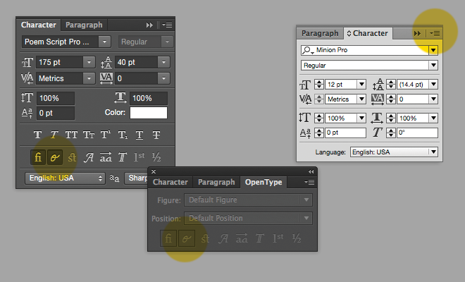
In the main Adobe apps, the trick to setting defaults is to open the program you’re about to use, and without any documents open, turning Contextual Alternates on in the Character panel (or in Illustrator, in the OpenType panel). Make sure ligatures are on as well. In Photoshop and Illustrator, these look like small buttons marked with an fi ligature, and a cursive o. In InDesign in the upper right of the Character palette, you’ll see a tiny triangle with four horizontal lines next to it; click on this icon to show more options. If you hover over the OpenType option, you’ll see Contextual Alternates in the menu. Verify that you’ve got a check mark next to this.
To set document defaults, do the same, just with a document open (but with nothing in it selected).
That’s it. You're ready to roll. Access the rest of your glyphs through the Glyphs palette to make any last adjustments when setting script type. Good luck, and ask for help here if you need it.

