Discover legacy content from FontShop.com, preserved for your reference.
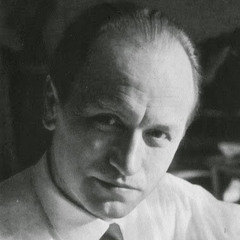
Hermann Zapf was born on 8 November 1918 in Nuremberg. He wanted to be an electrical engineer, but being the son of an active trade unionist who experienced trouble with the Nazi policy threw a monkey wrench in the works. Therefore, he accepted an apprenticeship as a retoucher, where he discovered his passion for calligraphy. Zapf met the legendary typographer Rudolf Koch from Offenbach, and studied the books of British fellow craftsman Edward Johnston in his spare time. In 1938 Zapf moved to Frankfurt, where he established his practice as a freelance type designer and calligrapher. Six months later he designed his first complete typeface, the broken script Gilgengart, for the engraver August Rosenberger who worked at the D. Stempel AG foundry since 1927.

In April 1939 Hermann Zapf was conscripted into the Reich Labor Service, to join thousands of workers reinforcing the 630 km-long Western Wall (“Siegfried Line”) against France. Since he was not able to cope physically with the grueling work, the officers reassigned Hermann Zapf to the back office where he wrote storage protocols in Kurrentschrift. When his entire labour group was conscripted into the Wehrmacht in September 1939, Zapf was retired due to health problems. The command of his company relocated him to Bordeaux, France as a cartographer, where he had to create secret maps for the entry in Spain. Shortly before the end of the war Hermann Zapf was taken into French captivity, where he was treated well. Due to his poor health he was allowed to return home to Nuremberg merely four weeks after the armistice.
At the end of 1946 Hermann Zapf received the news that the D. Stempel AG type foundry offered him a position. So he returned to Frankfurt where he became artistic director for postage stamps from 1947 to 1956. He was also part-time lecturer for typography at the current School of Design (HfG) in Offenbach from 1948 and 1950. During this period Zapf designed a dozen stamps for the German Post Office, among others for the series “Helper of Mankind”, the first prosperity stamps in the post-war Federal Republic.
Quickly Hermann Zapf’s calligraphy became increasingly in demand. In the early 1950s he worked as a graphic artist and book typographer for publishing houses like Suhrkamp, Insel (also Insel Library), the Gutenberg Book Guild or Carl Hanser Verlag. Even advertising agencies wanted his lettering for advertisements and packaging, yet Zapf never worked for advertising out of principle, and remained faithful to his stance until his death.
In 1949, at the occasion of German writer and statesman Goethe’s 200th birthday, the book Von der dreifachen Ehrfurcht – Gedanken Goethes über Erziehung zu edlem Menschentum was published in Frankfurt. Typography fans became enamored with the publication, as it was set in a test casting of Palatino., Hermann Zapf’s new type design. The next year the typeface was officially published, both for hand setting and Linotype machine setting. The italic and bold styles followed in 1951. The Mainz Gutenberg Yearbook was among the first users of the Palatino and made it popular. The international breakthrough of Palatino came in 1956, when Standard Oil Company adopted it for its annual report.

In the wake of Palatino another bestseller was released – the flared humanist sans serif Optima. This is how its peculiar history is described on The 100 Best Typefaces of All Time website:
“At the Franciscan Basilica di Santa Croce in Florence on 3 October 1950, one visitor was looking at the 276 gravestones through quite different eyes than the other tourists. The great names of Michelangelo, Rossini, Galilei and Machiavelli held less fascination for him than the great variety of lettering carved in the stone. Because he had left his notebook behind at the hotel, Hermann Zapf sketched a few characters on a 1000 lire note.
Back home in Frankfurt, the sketches became the breakthrough in a type project with which Zapf had been commissioned by the Stempel foundry: the design of a functional typeface somewhere between a sans-serif and a Renaissance Roman font. After thorough readability tests, the final drawings were completed in 1952 and August Rosenberger cut the type, which was released two years later under the name Optima.
Its appearance – both delicate and clear – was a novelty, and made it a favourite in advertising design, particularly in connection with perfumes and luxury goods. 50 years after its premiere, the font was comprehensively reworked under the name of Optima Nova. Without technical limitations or compromises, Hermann Zapf and Akira Kobayashi created an extended font family which finally included a true italic font, small capitals, text figures and a titling font with elaborate ligatures.”

From the early 1960s on Hermann Zapf embraced the combination of typography and computer software. This earned him a membership in the International Center for the Typographic Arts (ICTA) in New York, founded by the American typographer Aaron Burns and the Swiss typographer Emil Ruder. In Germany, however, his ideas for computer-aided typesetting were not taken very seriously at the time. Following a lecture in the US in 1964, the University of Texas at Austin showed interest in Zapf and offered him the office of professor. Yet he refused because his wife Gudrun Zapf-von Hesse was hesitant to move to the USA.
In 1972 he accepted a chair in typography at the Technische Universität Darmstadt, which he held until 1981. In 1976 he was offered the position of professor in computer-assisted typography by the Rochester Institute of Technology, the first-ever in the world. He accepted and taught from 1977 to 1987 alternating between Darmstadt and Rochester, as well as at the College of Graphic Arts and Photography.
Together with Aaron Burns and Herb Lubalin, the founders of the International Typeface Corporation (ITC), Hermann Zapf built the company Design Processing International Inc. in New York. Their goal was to develop programs for typographic structures that could be operated by non-specialists. The company existed until 1986. After the death of Lubalin, Zapf founded Zapf, Burns & Company in 1987, which existed until 1991.
In another collaboration, with Donald Knuth whom he met in 1971, Hermann Zapf pursued his fascination with computer-aided typesetting. He contributed to the development of fonts for the TeX typesetting program developed by Knuth. This collaboration spawned the scientific font family Euler, created for the American Mathematical Society. Together with Knuth, Zapf published the documentation for this font family titled AMS Euler – A New Typeface for Mathematics in 1989. In addition to the Latin alphabet it includes a Greek version, a fracture and a cursive.

Back in Germany Zapf developed the computer software “hz-program” in collaboration with the Hamburg-based type and technology company URW Software & Type GmbH. “Hz-program” made it possible to improve the micro-typographic intricacies in automatically set text, including kerning and letter spacing of text paragraphs. The underlying algorithms were later licensed by Adobe for InDesign. Today it drives the “Optical” kerning setting in the Character palette that cancels the built-in metrics in a font, providing a stopgap solution for poorly kerned fonts.
Over the past 25 years and together with Linotype in Bad Homburg, the publisher of his typefaces, Hermann Zapf dedicated himself to the legacy of his work. He revisited his bestsellers Optima and Palatino, reworking them extensively for contemporary digital publishing and, yes, he even ventured into type design experiments like Palatino Sans, released in 2006. The last major release was the original script face Zapfino that originated from a collaboration with the Californian type designer David Siegel in the early 1990s.
For almost 12 months Zapf and Siegel worked on the original version of Zapfino, based on quill calligraphy by Zapf from 1944. In 1993 Siegel came up with the idea for a chaos program at Stanford University. It would use a large supply of alternate character shapes to generate a living, human typeface. Shortly before the completion of the project David Siegel backed out due to personal issues.
In 1998, when attending a presentation at Linotype of Apple’s new TrueType GX font technology that could modulate characters, Hermann Zapf remembered these manuscript experiments. GX became later AAT (Apple Advanced Typography), a component of the Mac OS X operating system. When it was released it came with new fonts, including an upgraded Zapfino, to demonstrate the sophisticated automatic ligatures and contextual character substitutions. Today Zapfino still performs its impressive typographic wizardry on many computers – across platforms and beyond – thanks to OpenType technology.
Zapfino also was the very last type design project in which Hermann Zapf was involved, namely transposing this cursive style into the Arabic script. Lebanese type designer and Arabic legibility specialist Nadine Chahine rose to the challenge, finding over the course of months of hard work the delicate balance and compromise between the right-leaning Latin italic script and left-leaning Arabic script – under the watchful and interested eye of the original designer Hermann Zapf. Nadine Chahine recently presented the project at a Creative Morning session in Berlin – see the detailed blog post The Making of Zapfino Arabic and a video capture of her 20-minute presentation A Question of Slanted Writing.

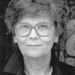
Hermann Zapf is survived by his widow Gudrun Zapf-von Hesse, whom he was married to since 1951. A trained expert bookbinder and a celebrated font designer herself, she is now 97 years old. From 1946 to 1954 she taught the typography course at the Städelschule in Frankfurt, while at the same time operating her own bookbinding workshop in Frankfurt (1946–1955). She designed numerous typefaces for the German type foundries D. Stempel AG, H. Berthold AG and URW in Hamburg, as well as for clients in the US, for example for Hallmark in Kansas City and Bitstream in Cambridge.
Gudrun Zapf-von Hesse is renowned in Germany and the United States. She was the recipient of the 1991 Frederic W. Goudy Award, which is comparable to the German Gutenberg Prize, and is considered the highest American award in the field of typography and book art. In 2001 Zapfest, an exhibition on calligraphy and type design in the San Francisco Public Library, honored the work of her and her husband, and San Francisco mayor Willie Brown proclaimed September 2 Hermann and Gudrun Zapf Day.
Condolences page In Memory of Prof. Hermann Zapf

Elsewhere
- Update to The Hermann Zapf Sketchbook Project, Kickstarter, June 5, 2015
- Hermann Zapf (November 8, 1918 – June 4, 2015), Typedrawers, June 5, 2015
- Zum Tod des Schrift-Connaisseurs Hermann Zapf, Deutschlandfunk, June 6, 2015
- Hermann Zapf R.I.P., Nerdcore, June 7, 2015
- Zum Tod von Hermann Zapf: Typen für die Welt, June 7, 2015
- Hermann Zapf, the font designer behind Palatino and Zapf Dingbats, has died at 96, Quartz, June 7, 2015
- Meister des Krimskrams, Süddeutsche Zeitung, June 8, 2015
- Hermann Zapf’s Obituary, linotype.com, June 8, 2015
- Hermann Zapf 1918–2015, Deutsche Briefmarken Zeitung, June 8, 2015
- Hermann Zapf ist tot, PAGE online, June 8, 2015
- Remembering Hermann Zapf, Kris Holmes, June 8, 2015
- Es gibt keine Entschuldigung für schlechte Typographie: zum Tode von Hermann Zapf, heise.de, June 8, 2015
- Typographer Hermann Zapf dies aged 96, Design Week, June 8, 2015
Sources.
Wikipedia, Linotype.com, The 100 Best Typefaces of All Time, typografie.info, Jürgen Röhrscheid, Creative Mornings Berlin.
Trademark attribution notice
Aldus, Optima, Palatino, ITC Zapf Chancery, Zapf Dingbats and Zapfino are trademarks of Monotype Imaging Inc. registered in the U.S. Patent and Trademark Office and may be registered in certain other jurisdictions.
